First impressions are vital, especially when it comes to business. Your website is often the first point of contact that potential customers will have with your company, so it’s critical to ensure that your site surprises, delights, and fulfills your target audience.
If your website looks outdated, it reflects poorly on your business as a whole. A modern design shows that you are keeping up with the times and are invested in your online presence.
But what goes into a proper redesign? Take a look at how the UX experts at Optimum7 redesigned the storefront for ClassroomEssentialsOnline.com to boost traffic, engagement, and conversions.
User Experience Case Study: ClassroomEssentialsOnline.com
At Optimum7, we understand that a well-designed website reflects the quality of your products or services.
That’s why we were excited to work with classroomessentialsonline.com to reimagine their website and create a more engaging user experience.
The old website was dated and difficult to navigate, making it hard for potential customers to find what they were looking for. Our team worked closely with the client to understand their goals and create a new design that would appeal to their target audience.
Home Page: Like a Landing Page for Your Organic Traffic
The first thing that users see when they visit your website is the home page.
This is why it’s important to make sure that it makes a good impression and encourages users to stay on your site.
The home page should be designed to grab attention and give users an overview of what your website has to offer.

Some of the things that we kept in mind while redesigning the home page include:
- Ensuring that the most important information is prominently displayed
- Creating a visually appealing design
- Confirming that the user experience is smooth and easy to navigate
We also made sure to include some key features such as product categories and search functionality.
Site Search Functionality removes roadblocks to conversion.
Optimum7’s Site Search Functionality is one of the most important features that a website can have. It allows users to quickly and easily find the information they are looking for, without having to navigate through an entire website.
This can be a lifesaver for users who are looking for specific information on a website with a lot of content. Additionally, a search functionality improves the overall usability of a website by making it easier for users to find what they are looking for.
Because it minimizes frustration, our Site Search feature empowers ClassroomEssentialsOnline.com to guarantee a positive user experience for their visitors.
Product Pages: Transparency, Efficiency, and Encouragement
The design of the product pages was another area that we focused on.
Since potential customers will be spending a lot of time on these pages, it’s important to make sure that they are well-designed and user-friendly.
Trust Building Elements
When customers are looking to purchase a product, they want to be sure that they are getting a high-quality item for their money.
In fact, potential customers are more likely to purchase a product if they can see that other people have bought it and liked it.
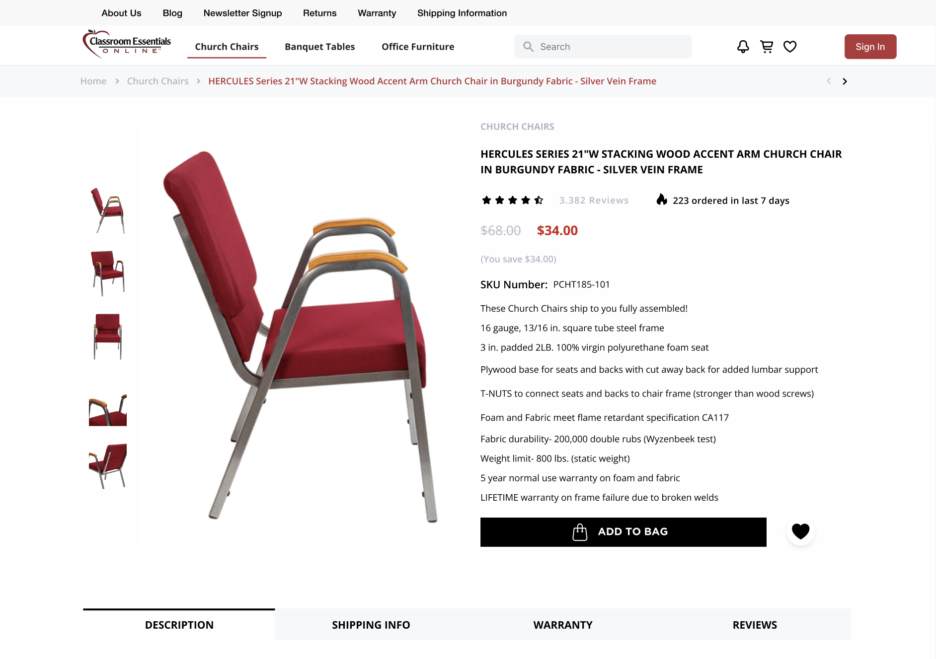
This is why having reviews on your product pages is vital. People want to see that others have had a positive experience with the product before they make a purchase.
In addition, reviews can provide valuable feedback about the product itself, which can help you to improve your offering. Of course, not all reviews will be positive, but as long as you respond to negative feedback in a professional and constructive manner, it can still be beneficial.
Ultimately, including reviews on your product pages is a great way to build trust with potential customers. It highlights that you are committed to providing an excellent customer experience.
Product Descriptions & Images should be clear and irresistible.
In today’s highly competitive marketplace, it is more important than ever to make sure your products stand out from the crowd.
High-quality images can help you do just that.
By showing potential customers exactly what your product looks like, and highlighting its key features, you can give them the information — and encouragement — they need to make a purchasing decision.

In addition, well-chosen images can convey a sense of luxury and attention to detail that instills confidence in your brand.
Whether you are selling online or in a brick-and-mortar store, investing in high-quality product images is an essential part of ensuring your business’s success.
Related Product Recommendations are vital for cross- & upselling.
Adding recommendations to the bottom of your page can be a great way to increase your conversion rate (CVR) and average order volume (AOV). By showing your visitors products that they may be interested in, you can encourage them to make an additional purchase.

Additionally, by including a variety of recommendations, you can ensure that there is something for everyone. And, by offering a discount or incentive for making a purchase, you can further encourage your visitors to buy from you.
So, if you’re looking for ways to boost your bottom line, adding recommendations to your page is a great place to start.
Our Sticky Add-to-Cart Functionality reduces pain points (and effort!).
The add-to-cart button is one of the most important elements on a product page. After all, if a customer can’t easily add an item to their cart, they’re unlikely to make a purchase.
Unfortunately, it’s all too easy for customers to get distracted and click away from the add-to-cart button before they’ve actually added anything to their cart. One way to prevent this from happening is to add a sticky add-to-cart button to your product pages.

This ensures that the add-to-cart button remains in front of the user at all times, increasing the chances that they’ll actually add an item to their cart.
And that means more sales for your business.
For a simple way to bump up your CVR, add the Sticky Add-to-Cart Functionality to your storefront.
Mega Menu Functionality minimizes frustration from choice abundance.
The last thing you want is for potential customers to click away from your site because they can’t find what they’re looking for.
This is why having a well-designed menu is so important. A good menu should be easy to use and intuitive, allowing visitors to find what they’re looking for with ease.
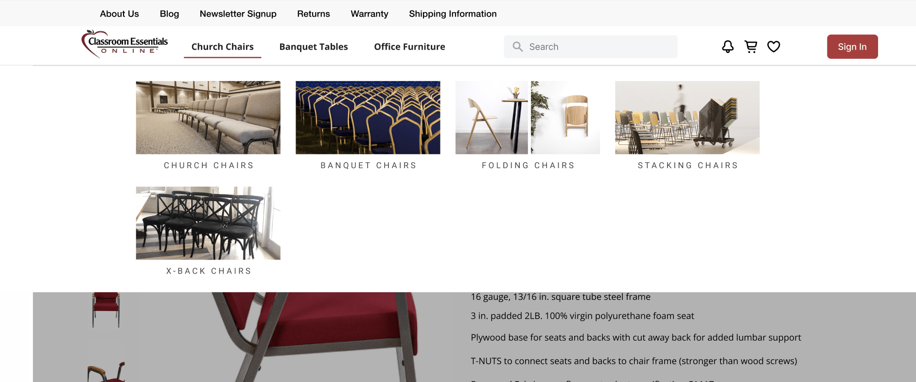
If you have a large website with lots of pages and options, you may want to consider using a mega menu. A traditional drop-down menu can become difficult to use when there are too many options, making it hard for users to find what they’re looking for.
This is especially true for eCommerce pages, which often have a lot of different categories and products. Mega menus can help to solve this problem by displaying all of the options in a clear and organized way.
Best of all, it also boosts sales by making it more likely that users will see the products they’re interested in within seconds of arriving on your page.
Conclusion: Resolve the Roadblocks on Your Site to Boost CVR
There are a lot of factors to consider when designing an eCommerce website. However, if you keep the user experience in mind, you can create a site that is both attractive, intuitive, and profitable.
By focusing on the design of your website, you can ensure that potential customers have all the information they need and it’s easy enough to make a purchase. And by adding features like recommendations, sticky add-to-cart buttons, and site search functionality, you can further increase your chances of making a sale.
If you think your website needs a new design, we’ve got you covered! Contact Optimum7 today to start optimizing your storefront today.


