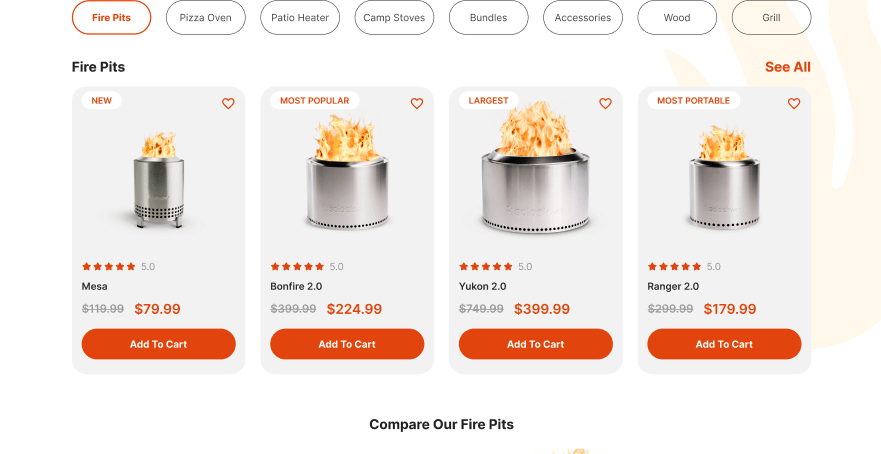
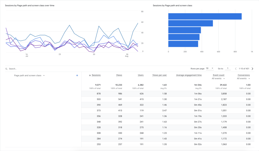
In today’s digital age, a robust online presence is crucial for any e-commerce business. SoloStove.com, a market leader in smokeless fire pits, tabletop fire pits, pizza ovens, camp stoves, backyard accessories, and patio heaters, recognized the need to elevate their online user experience to reflect the high quality of their products. Their existing website, while functional, lacked the modern features and intuitive design necessary to meet the expectations of today’s consumers. This realization led to a comprehensive redesign aimed at improving user engagement, increasing customer trust, and boosting sales.
The redesign of SoloStove.com was driven by a clear objective: to create a seamless and enjoyable shopping experience. Every aspect of the website was scrutinized and revamped, from the homepage to the product pages. The new design focuses on usability, aesthetic appeal, and functionality, ensuring that customers can easily find and purchase the products they need. This article details the key changes implemented during the redesign, highlighting the importance and benefits of a user-focused approach.
Through thoughtful design and strategic enhancements, SoloStove.com now offers a website that not only attracts visitors but also keeps them engaged and encourages them to complete their purchases. By examining the specific improvements made, other businesses can gain valuable insights into how a modern, intuitive website can drive significant business benefits and help them stay competitive in an ever-evolving digital landscape.
Product Pages Enhancements
Verified Product Ratings
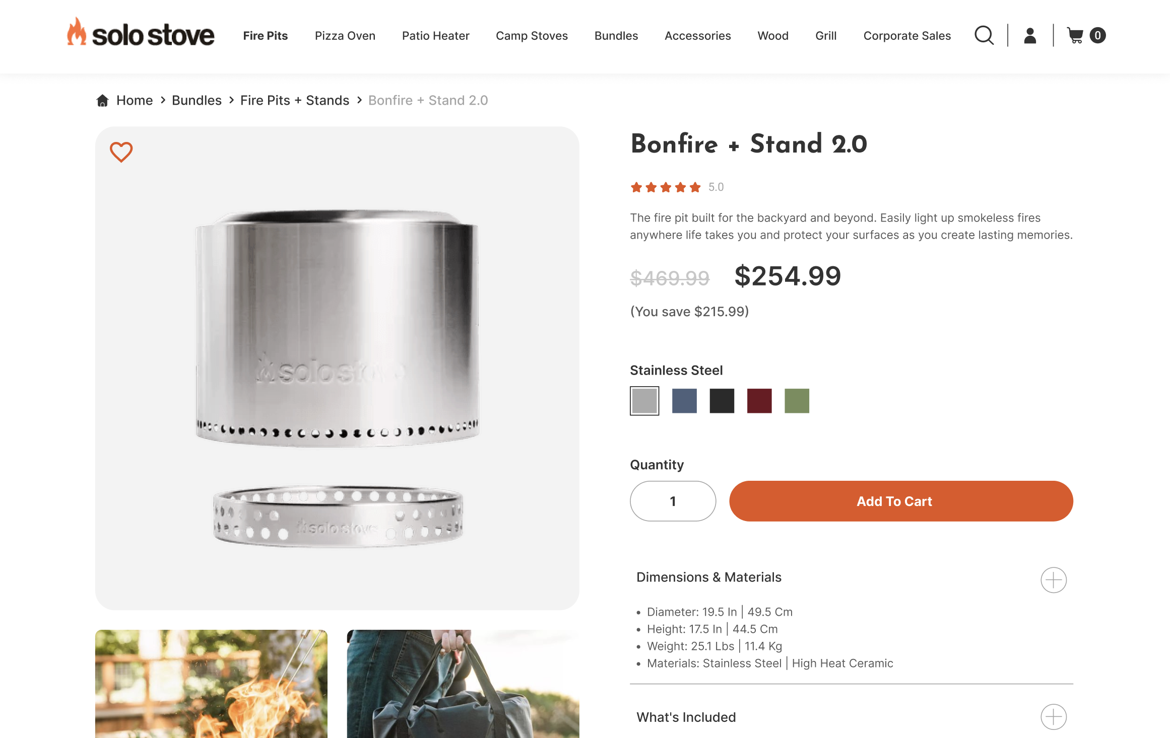
Integrating verified product ratings on SoloStove.com establishes customer trust by ensuring the authenticity of reviews. Genuine feedback from verified purchasers reassures potential buyers, making them more likely to trust the product and proceed with a purchase. This feature directly addresses the common concern of fake reviews, enhancing credibility and increasing conversion rates.
Product Highlights and Features
Presenting product highlights and features clearly and concisely is crucial. The redesigned product pages use bullet points, icons, and brief descriptions to convey essential information quickly. This approach helps customers grasp the benefits and specifications of a product at a glance, facilitating informed decision-making and reducing the likelihood of users feeling overwhelmed by excessive details.
For example, a Solo Stove fire pit page now includes key features such as “smokeless design,” “stainless steel construction,” and “portable for camping.” These highlights are presented in a visually appealing format that enhances readability and engagement, encouraging users to explore further.
Up-Selling and Cross-Selling
Implementing up-selling and cross-selling strategies increases the average order value and enhances the shopping experience. Up-selling involves presenting higher-quality or premium alternatives, while cross-selling suggests complementary products that enhance the primary purchase.
For instance, when a user views a Solo Stove fire pit, they might see recommendations for accessories like firewood stands, covers, or grill tops. These suggestions not only add value to the purchase but also improve customer satisfaction by providing a more comprehensive solution. This strategic placement of related products encourages users to consider additional purchases, thereby increasing overall sales.
Sticky Add to Cart Functionality
What is Sticky Add to Cart?
The sticky add-to-cart functionality ensures the cart button follows the user as they scroll through a product page. This feature maintains constant visibility, allowing users to add items to their cart at any point without having to scroll back to the top. It is
especially beneficial on mobile devices, where screen space is limited and extensive scrolling can be cumbersome.
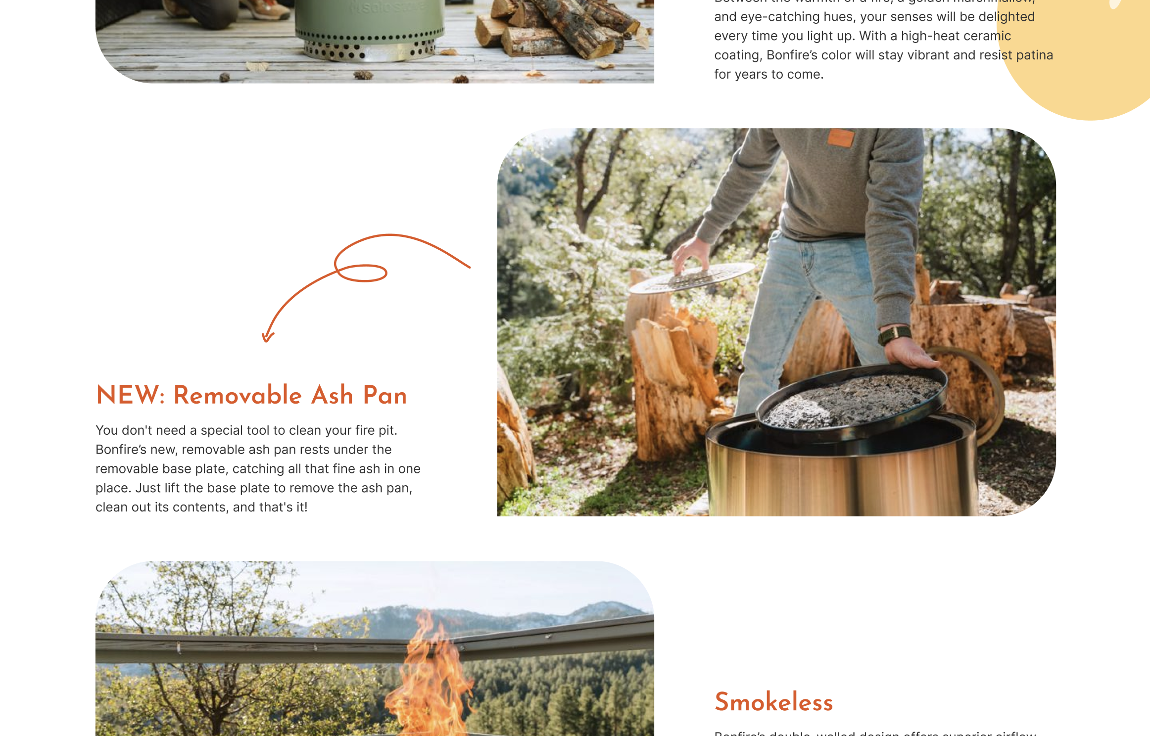
Importance and Benefits
Constant visibility of the add-to-cart button reduces friction in the purchasing process. Users can add products to their cart quickly and effortlessly, enhancing their overall shopping experience. This accessibility is crucial for maintaining user engagement and reducing drop-offs during the decision-making process.
Research shows that implementing a sticky add-to-cart button can increase conversion rates by up to 8%. This improvement is due to the reduced effort required to add items to the cart, leading to higher completion rates for purchases. For SoloStove.com, this feature ensures that users are more likely to complete their purchases, boosting sales and customer satisfaction.
The sticky add-to-cart functionality exemplifies how small design changes can significantly impact user experience and business outcomes. By making the purchasing process more intuitive and accessible, SoloStove.com enhances user engagement and drives higher conversion rates.
Quick View Functionality and Hover Effects
Hover Effects
Hover effects are interactive features that respond when users place their cursor over a web element. On SoloStove.com, these effects highlight key items, making the site feel more dynamic and engaging. For example, when a user hovers over a product image, it might enlarge or display additional information, providing immediate visual feedback. This not only improves user interaction but also guides visitors’ attention to important elements.
Hover effects enhance the browsing experience by making navigation intuitive and enjoyable. They indicate that the site is responsive and modern, which increases user trust and satisfaction. These subtle visual cues help users explore the site more efficiently, encouraging them to interact with various elements and discover more products.
Quick View Functionality
Quick view functionality allows users to preview product details without leaving the current page. On SoloStove.com, this feature significantly improves the shopping experience by making it faster and easier to browse multiple products. Instead of loading separate product pages and navigating back and forth, users can view essential information in a pop-up window, saving time and effort.
For instance, when a user hovers over a product image, a “Quick View” button appears. Clicking this button opens a pop-up with key product details, such as price, specifications, and customer reviews. This allows users to quickly assess whether the product meets their needs without disrupting their browsing flow.
The quick view feature is particularly valuable for users who are comparing multiple items or who want to make quick purchasing decisions. It streamlines the shopping process, reduces frustration, and increases the likelihood of conversions. Users can quickly find and decide on their desired products, leading to a smoother and more efficient shopping experience.
Homepage Redesign
Header Banner
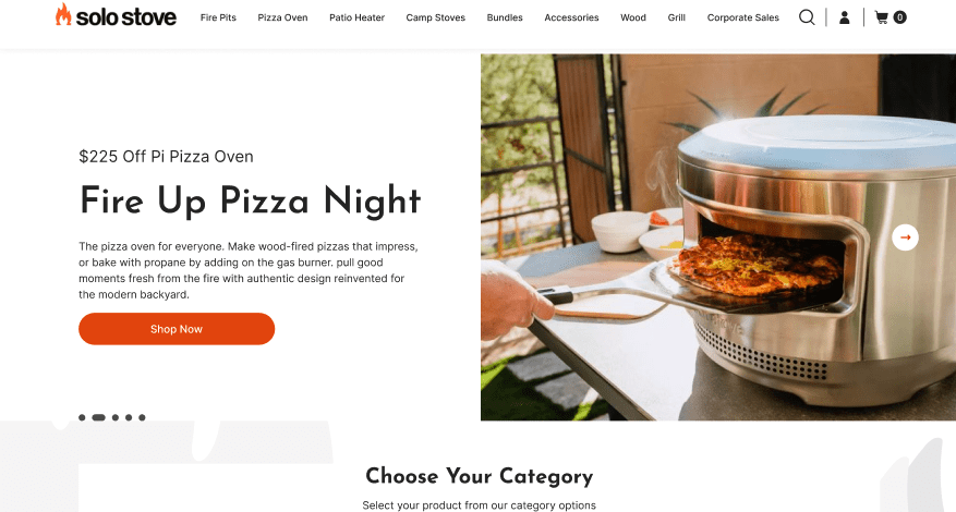
The header banner is the first thing visitors see when they arrive at SoloStove.com, making it a critical marketing tool. The redesign focused on creating a bold and engaging banner that clearly communicates the brand identity and core offerings. High-quality images and concise messaging are used to capture user interest immediately, setting a positive tone for the entire browsing experience.
A compelling header banner boosts customer engagement by providing a clear, attractive introduction to the site’s products and values. It acts as a digital billboard, announcing key promotions, new arrivals, or unique selling points. This strategic placement helps visitors quickly understand what SoloStove offers, encouraging them to explore further and increasing the likelihood of conversions.
User Interface (UI) Enhancements
The redesigned user interface is visually appealing and easy to navigate. Modern, interactive UI elements enhance the user experience by making the site more engaging and intuitive. For example, streamlined menus, clean layouts, and interactive buttons guide users effortlessly through the site. These elements not only retain visitors but also build a sense of trust in the brand’s professionalism and quality.
Simplifying the interface and using clear language prevent user confusion, making it easier for visitors to find what they need quickly. This streamlined design reduces bounce rates and encourages users to spend more time on the site, ultimately leading to higher conversion rates. By focusing on usability, SoloStove ensures that the shopping experience is both enjoyable and efficient.
Value Proposition Highlighting
Prominent placement of value propositions on the homepage is essential for capturing user interest. Phrases like “High Quality” or “50% Off” are strategically highlighted to attract attention and communicate the benefits of SoloStove’s products immediately. These value propositions are displayed using eye-catching fonts and colors to ensure they stand out. This direct approach helps potential customers quickly understand why they should choose SoloStove over competitors, driving engagement and conversions.
Mega Menu Implementation
Advantages of Mega Menus
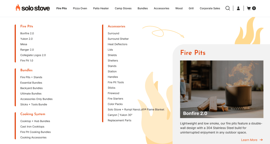
Mega menus offer a superior navigation experience, especially for websites with extensive content and product categories like SoloStove.com. Unlike traditional dropdown menus, which can become cluttered and hard to navigate, mega menus provide a clear, organized way to present multiple options without overwhelming the user.
The new mega menu on SoloStove.com allows users to quickly access different product categories, services, and relevant content. This structured approach reduces the time and effort needed to find specific items, enhancing overall user satisfaction. Mega menus display a wide range of options in an intuitive and visually appealing manner, helping users to easily discover the breadth of offerings.
User Navigation and Experience
By implementing a mega menu, SoloStove.com has significantly improved user navigation. The menu’s design promotes relevant products and guides shoppers precisely to what they are looking for. This streamlined navigation is crucial for retaining visitors and encouraging them to explore more pages and products.
Mega menus also help in reducing bounce rates by making it easier for users to find what they need without feeling frustrated or lost. Each category within the mega menu is thoughtfully organized and clearly labeled, ensuring users can quickly locate the information or products they seek. For instance, the fire pit category might include subcategories like “Smokeless Fire Pits,” “Tabletop Fire Pits,” and “Fire Pit Accessories,” each leading to a dedicated section filled with relevant products and information.
This enhancement is particularly beneficial for e-commerce websites, where a seamless shopping experience can lead to higher conversion rates and increased customer loyalty. The mega menu’s ability to present a large volume of options in an accessible and user-friendly manner makes it a powerful tool for enhancing the overall shopping experience.
By adopting these features, SoloStove.com has created a more engaging, intuitive, and efficient online shopping environment. These changes highlight the importance of user-centered design and serve as a valuable example for other e-commerce businesses looking to improve their websites and boost customer satisfaction.
Category Pages Optimization
Search Interface Improvements
Category pages are essential for helping users find products quickly and efficiently. According to Forrester Research, 43% of website visitors immediately head to the search bar on e-commerce websites. Recognizing this behavior, SoloStove.com redesigned their search interface to be more interactive, easy to use, and visually appealing.
The search bar is prominently placed and optimized for accuracy and relevance. As users type, the search function provides instant suggestions, helping them find what they need faster. This auto-complete feature not only saves time but also guides users toward popular products and categories, increasing engagement.
An improved search interface significantly enhances user experience by making navigation seamless. Users who find what they are looking for quickly are more likely to convert, making this feature a critical aspect of the website redesign. Enhanced search functionality can engage users more effectively and make them 1.8 times more likely to convert than non-searchers.
Filtering System
A robust filtering system is indispensable for websites with extensive product inventories. Filters help users narrow down their choices quickly, presenting options that meet their specific needs. On SoloStove.com, the filtering system is designed to be intuitive and comprehensive, allowing users to filter products by categories, price ranges, ratings, and other relevant attributes.
For example, users looking for a fire pit can filter by size, fuel type, and price, ensuring they find exactly what they need without sifting through irrelevant options. This user-friendly approach not only improves the shopping experience but also increases the likelihood of conversions. Even the simple act of adding filters can increase a website’s conversion rate by 26%.
A well-designed filtering system also helps in reaching a wider audience by accommodating diverse user preferences. It makes the shopping process more efficient and enjoyable, encouraging users to return for future purchases. By enhancing the usability of category pages, SoloStove.com ensures that users can easily find and purchase products, leading to higher satisfaction and loyalty.
Conclusion
The redesign of SoloStove.com exemplifies the transformative power of thoughtful, user-centered web design. From the homepage to the product and category pages, every change was made with the user in mind, resulting in a more engaging, efficient, and satisfying shopping experience.
Enhancements like verified product ratings, clear product highlights, and strategic up-selling and cross-selling on product pages build trust and facilitate informed purchasing decisions. The introduction of sticky add-to-cart functionality ensures that the purchasing process is seamless and accessible, boosting conversion rates.
The implementation of a mega menu improves navigation by presenting a wide range of options in a clear and organized manner. Optimizing category pages with an improved search interface and robust filtering system makes it easier for users to find exactly what they need, further enhancing the user experience.
These improvements are not merely aesthetic; they represent strategic decisions aimed at driving better business outcomes. By focusing on usability, navigation, and user engagement, SoloStove.com has created a modern, intuitive website that meets the evolving needs of today’s consumers. This comprehensive redesign serves as a valuable blueprint for any e-commerce business looking to improve their online presence and achieve sustainable growth.


