We set out to redesign thebbqdepot.com with two goals in mind: higher conversions and better user experience. We knew that we could increase their conversions with a new design that looks more modern and quality than their current website design. We also wanted to improve the overall user experience, making it easier for visitors to find what they were looking for and navigate their site.
The first step was to take a close look at their site’s analytics. We wanted to see where visitors were coming from, what pages they were spending the most time on, and what pages they were leaving from. This gave us a good starting point for our redesign.
Next, we looked at their top competitors. We wanted to see what they were doing right and learn from their mistakes. This helped us fine-tune our own redesign goals.
Once we had a good understanding of our goals and where we wanted to go, we started wireframing. We sketched out some rough ideas for how we wanted the site to look and function. This was a crucial step in making sure that our redesign would be successful.
After the wireframing stage, it was time to start designing the actual website.
Home Page
The home page is the most important page on the site, so we wanted to make sure that it was designed to convert visitors into customers. We started by adding a large hero image with a call-to-action (CTA) button. This immediately grabs the visitor’s attention and tells them what they can do on the site.
We also made sure to include easy navigation on the home page. We wanted visitors to be able to find what they were looking for without any difficulty.
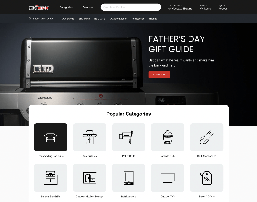
A brand new user interface will help increase customer engagement, trust, and loyalty. Customers are more likely to stay on a website or product if it has a modern and interactive design.
On the other hand, outdated and text-heavy websites can drive customers away because they appear untrustworthy and of poor quality.
In order to compete in today’s market, it is essential to have a sleek and user-friendly interface that will set you apart from your competitors.
Investing in a good UI design is an important step in ensuring the success of any business.
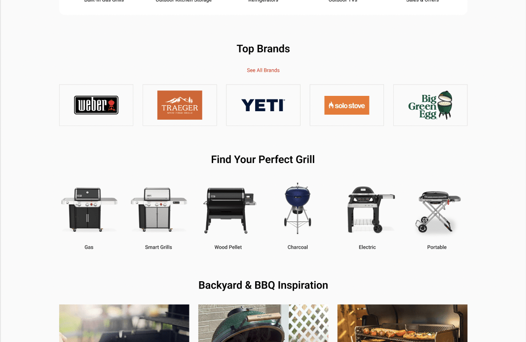
Your product is a key differentiator in your industry and the way you talk about it can make or break customer loyalty.
By keeping your design clean and simple, you’ll help your customers focus on what’s important and prevent any confusion.
The redesigned home page is designed to increase conversions and improve the overall user experience. We’ve included easy navigation, a sleek design, and social proof to help build trust with potential customers.
We also added the “BBQ Inspiration” part to build trust. This section enforces the idea that thebbqdepot.com is an established BBQ retailer and knows all there is to know about BBQs.
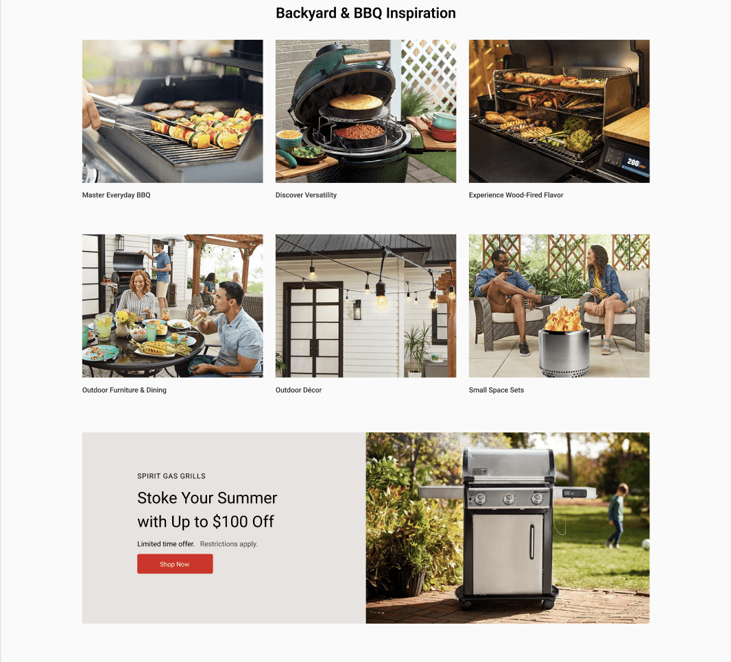
A website’s interface is one of the most important aspects of its design.
A good interface should be easy to use and navigate, even for first-time visitors. The layout should be logical and intuitive, and all the website’s features should be easily accessible.
In addition, the interface should be responsive and compatible with all common web browsers.
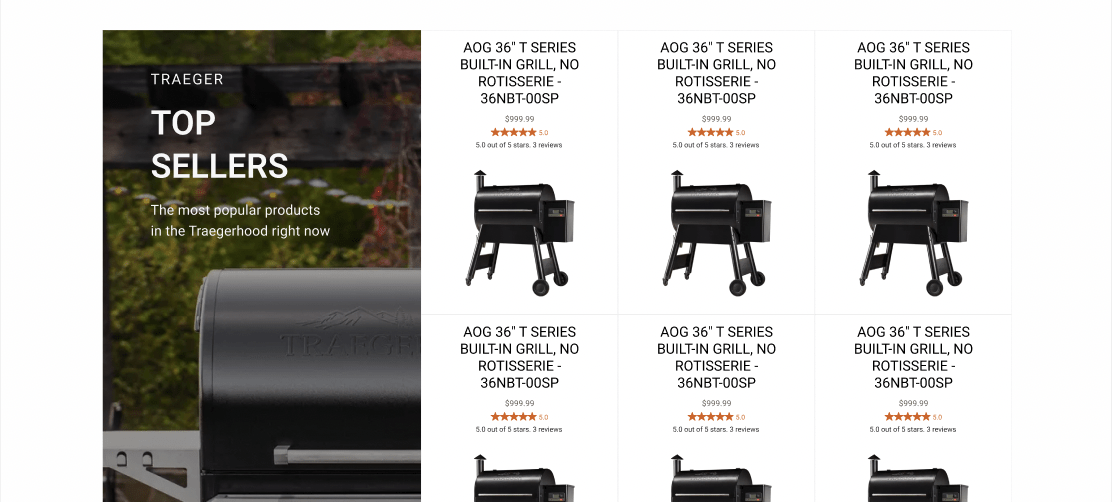
We also made sure to add social proof to the home page. This is a powerful way to increase conversions by showing potential customers that others have used and liked your product.
Including customer testimonials, reviews, and ratings will help build trust and show potential customers that your product is worth their time and money.
Mega Menu
The mega menu is one of the most important features on the website. This is because it allows visitors to easily find what they’re looking for, without having to click through multiple pages.
We designed the mega menu to be user-friendly, visually appealing and easy to navigate. It is also responsive and mobile-friendly, so it will work on all devices.
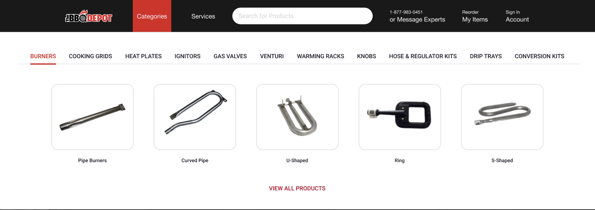
When it comes to website navigation, mega menus are often seen as an improvement over regular drop-down menus. Drop-down menus can become difficult to read when there are too many options, making it hard for users to find what they’re looking for.
Mega menus, on the other hand, can provide a more efficient way to organize a large number of options and showing visuals. By displaying all of the choices in a single menu, users can more easily scan and find the option they’re looking for.
This can be particularly helpful on eCommerce pages, where users may be looking for specific product categories. In addition, mega menus can be customized to fit the needs of each individual website.
As a result, they offer a versatile and effective solution for websites with large amounts of content.
Product Pages
The product pages on thebbqdepot.com have been designed to be as user-friendly and informative as possible.
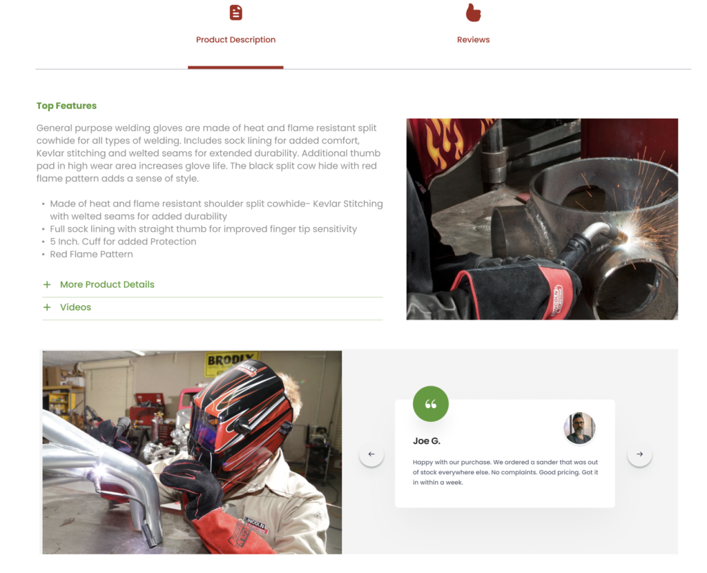
We’ve included high-quality photos, clear descriptions, and helpful customer reviews to give potential buyers all the information they need to make a purchase.
We’ve also made it easy for visitors to find related products, so they can explore other options if they’re not sure what they want.
Product pages are an important part of any eCommerce website. They are the pages that potential customers will use to make a purchase, so it’s important to make them as user-friendly and informative as possible.
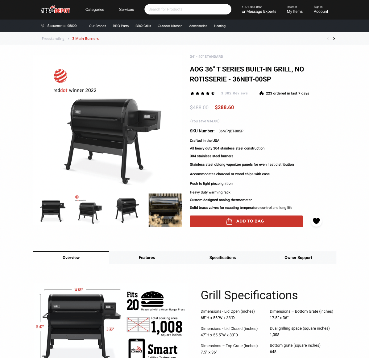
The photos on the product pages are high quality and provide a clear view of the product. The descriptions are concise and to the point, without any unnecessary fluff.
In addition, the customer reviews are helpful and give potential buyers an idea of what others think of the product. Overall, the product pages on thebbqdepot.com are well-designed and offer everything potential customers need to know before making a purchase.
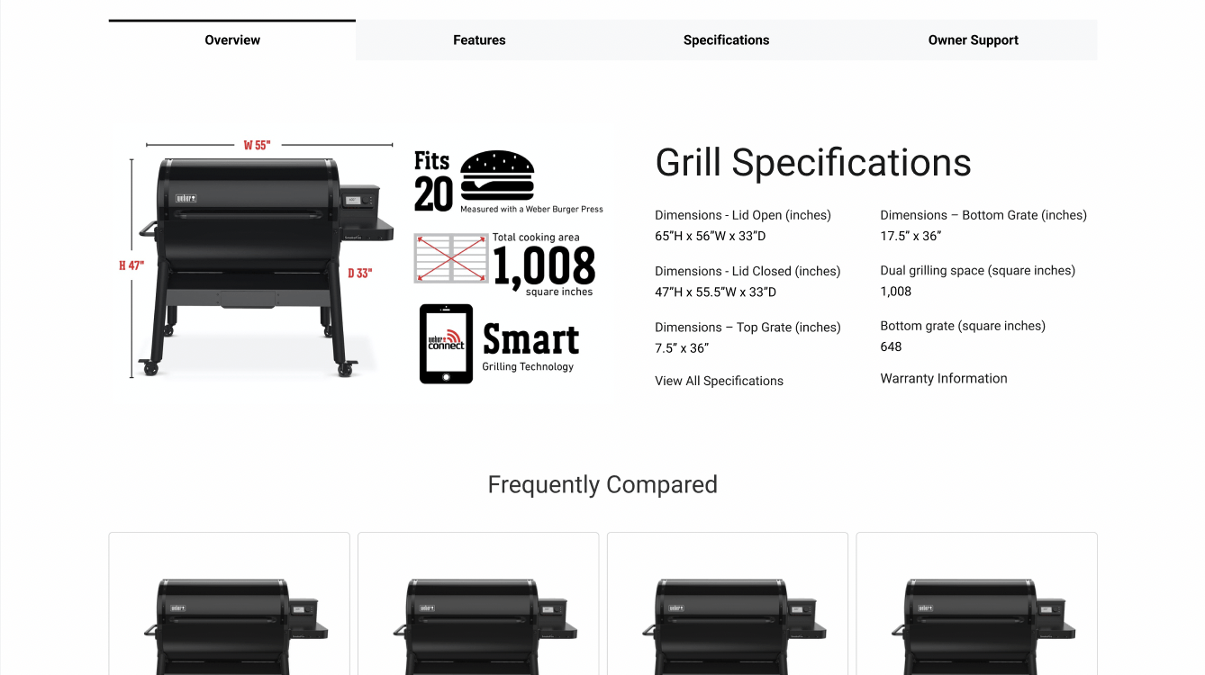
In order to boost trust with potential customers, it is important to present product highlights and features without overwhelming them. Too much information at once can be confusing and off-putting, so it is important to focus on a few key points.
Present these points in an easily digestible format, such as a list or bullet points. Highlight the unique selling points of your product and make sure to address any common concerns that potential customers may have.
By taking a customer-centric approach, you will be able to build trust and increase the likelihood of making a sale.
Site Search and Filter Functionality
The site search and filter functionality on thebbqdepot.com have been designed to help visitors find what they’re looking for as quickly and easily as possible.
The search bar is prominently displayed on the homepage, so visitors can immediately start looking for a specific product. The filters are located on the left side of the page, and they can be used to narrow down the results by category, price, or brand.
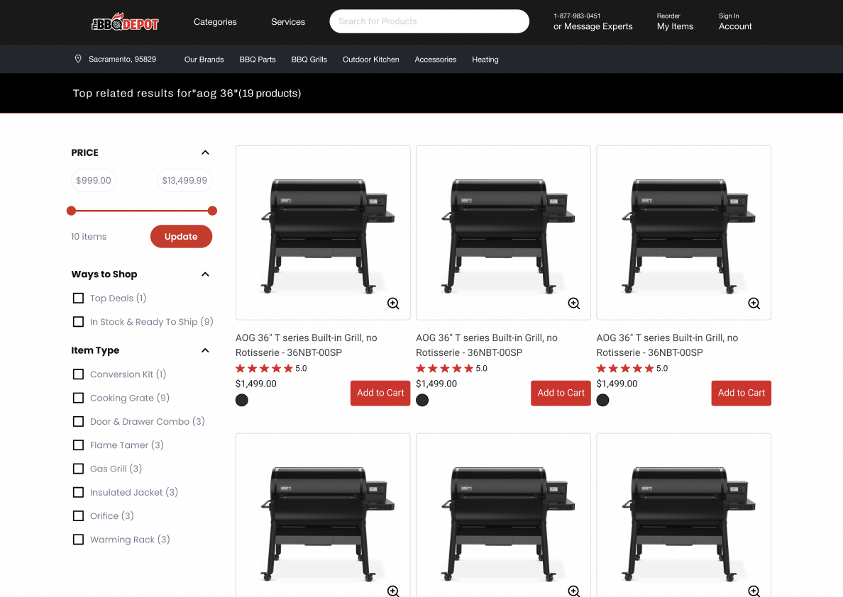
This makes it easy for visitors to find exactly what they’re looking for without having to click through multiple pages.
A study by Forrester Research found that 43% of website visitors immediately head to the search bar when they land on an eCommerce site. This Behavior is especially pronounced among mobile users, who are generally looking for a quick and easy way to find the products they need.
A well-designed search interface can make a significant difference in conversion rates, as searchers are 1.8 times more likely to convert than non-searchers. To ensure that your search interface is optimally effective, it should be interactive, easy to use, and aesthetically pleasing.
By following these guidelines, you can give your customers the best possible experience and maximize your chances of making a sale.
The search and filter functionality by Optimum7 is an important part of any eCommerce website. It helps visitors find what they’re looking for quickly and easily, without having to click through multiple pages.
Quick View Feature
The all-new quick view feature on thebbqdepot.com allows visitors to get a quick overview of a product without having to leave the page they’re on.
This is helpful for visitors who are looking for general information about a product and don’t need to see all the details.
To use the quick view feature, simply hover over a product image and click on the “Quick View” button. This will open up a popup with information about the product’s price, rating, and available colors.
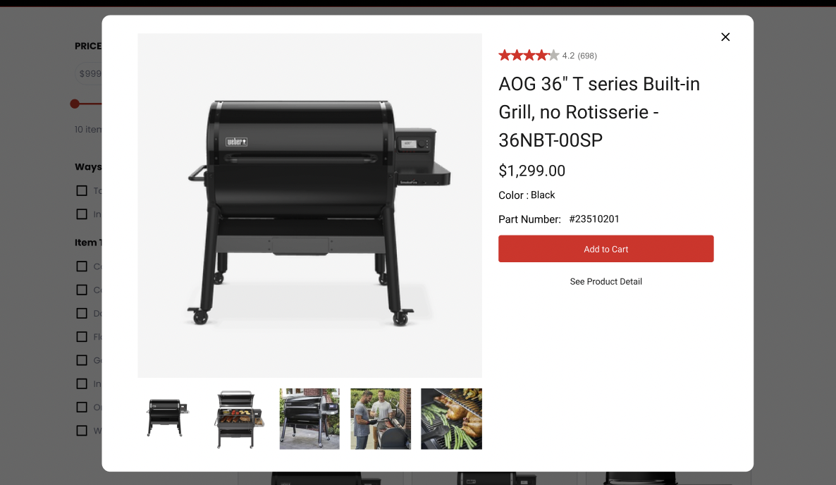
If you’re interested in learning more about the product, you can click on the “See Product Detail” button to be taken to the full product page.
Conclusion
We redesigned thebbqdepot.com with the customer in mind.
The new design is clean and user-friendly, with high-quality product photos and concise descriptions.
In addition, the site search and filter functionality makes it easy for visitors to find exactly what they’re looking for.
Finally, the quick view feature allows visitors to get a quick overview of a product without having to leave the page they’re on.


