In the competitive realm of online automotive parts retail, the digital facade of a business can be as crucial as the quality of the products it offers. PowertrainProducts.net, a leader in remanufactured and rebuilt engines, recognized this as they embarked on a comprehensive journey to revamp their website. This transformation wasn’t just a routine update; it was a strategic reimagining aimed at reinforcing their commitment to “The Largest Selection of Remanufactured and Rebuilt Engines.” This article will delve into the various facets of this transformative redesign, illustrating how strategic website enhancements are not merely aesthetic improvements but pivotal business investments. We will explore how the overhaul of PowertrainProducts.net was not just about staying abreast of digital trends but about fundamentally enhancing customer engagement and trust.
A New Dawn on the Homepage
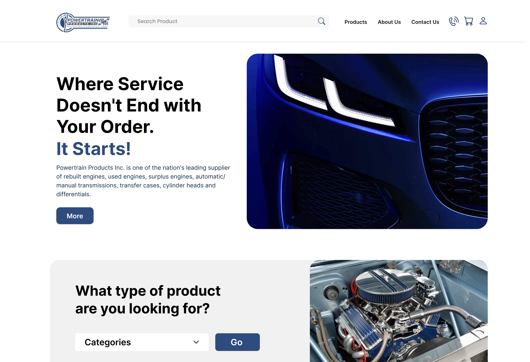
The redesign of PowertrainProducts.net begins with the most impactful element: the header banner. In the digital world, a website’s header banner is its first handshake with visitors, its first opportunity to make an impression. Recognizing its importance, the new header banner was designed to be more than just an attractive image; it’s a storytelling canvas. It vividly announces who PowertrainProducts.net is and what they stand for, effectively communicating their brand identity and value proposition. This revamped banner is not just a visual element; it’s a strategic tool that sets the tone for the customer’s journey, portraying the company’s commitment to quality and service right from the start.
Revolutionizing the User Interface
At the heart of the website’s transformation is the complete overhaul of the User Interface (UI). The new UI design aims to significantly increase customer engagement and trust – two pillars crucial for online retail success. By moving away from outdated, text-heavy layouts to a cleaner, more interactive, and visually appealing interface, PowertrainProducts.net now offers an online experience that’s not only in line with current design trends but also aligns with user expectations for simplicity and ease of navigation. This shift towards a more engaging and intuitive UI design is key in differentiating Powertrain Products from its competitors, positioning it as a forward-thinking leader in its market.
Embracing Simplicity in Design
The redesign of PowertrainProducts.net also embraces the principle of simplicity in design. In today’s fast-paced digital world, users prefer websites that offer clear, straightforward paths to what they need. The new website design reflects this by using clear language and avoiding unnecessary complexities. This simplification makes for an improved user experience, ensuring that both seasoned customers and first-time visitors can navigate the site with ease and find what they’re looking for without any confusion.
Prioritizing Accessibility
Inclusivity was a cornerstone of the redesign. The updated PowertrainProducts.net is built with accessibility in mind, ensuring that it’s a welcoming and navigable space for all users, regardless of their technical abilities or disabilities. This commitment to accessibility not only broadens the site’s reach but also reinforces Powertrain Products’ dedication to serving all its customers, reflecting a deep understanding of and respect for the diverse needs of its user base.
In this part, we’ve examined the foundational changes made to the PowertrainProducts.net homepage. Each element, from the impactful header banner to the simplified user interface, works cohesively to create a welcoming and efficient entry point for shoppers. This is just the beginning of a deeper dive into the extensive redesign that has positioned PowertrainProducts.net as a frontrunner in the digital space for automotive engines and parts.
Streamlining Category Pages for Enhanced Engagement
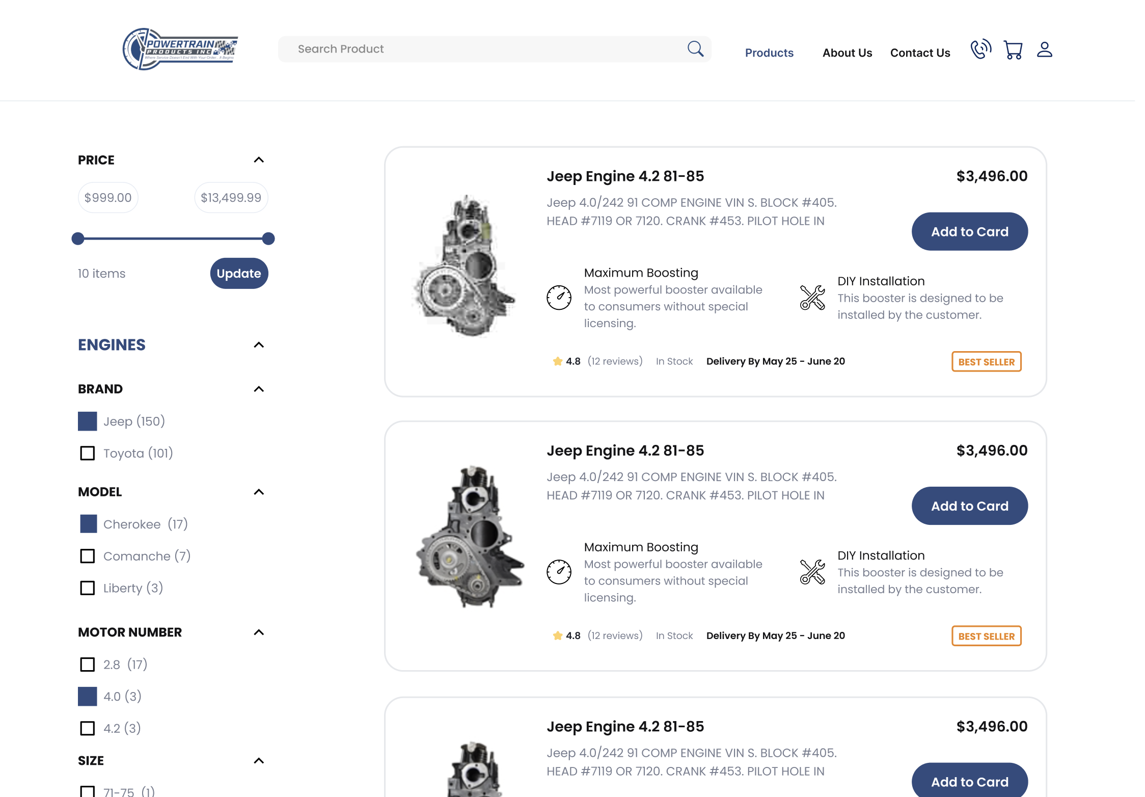
The revamp of PowertrainProducts.net brought a significant enhancement to its category pages, particularly through the optimization of search and filtering systems. Understanding that a large portion of website visitors use the search function as their entry point, the redesign focused on creating an interactive, visually appealing, and user-friendly search interface. This new interface simplifies the process of finding specific products within Powertrain Products’ extensive inventory. Enhanced search functionality coupled with advanced filtering options means customers can now effortlessly narrow down their search based on specific criteria such as engine type, make, model, or year. This level of precision in product search not only improves the user experience but also significantly boosts the likelihood of conversions by swiftly guiding customers to the products that best meet their needs.
Effective Product Categorization
Alongside improved search capabilities, the redesign of PowertrainProducts.net also addressed the categorization of products. With a vast array of engines and automotive components, effective categorization is crucial. The website now boasts a more logical and intuitive categorization system, making it easier for customers to navigate and find what they are looking for. By organizing products in a clear, structured manner, the website facilitates an enhanced user journey, encouraging exploration and discovery. This improved categorization not only aids in user retention but also ensures a better overall shopping experience, catering to both seasoned professionals and casual browsers alike.
Perfecting Product Pages for Customer Trust and Sales
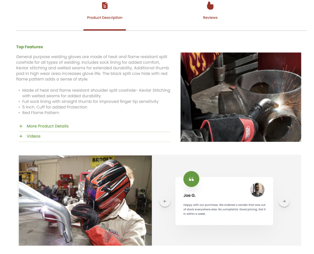
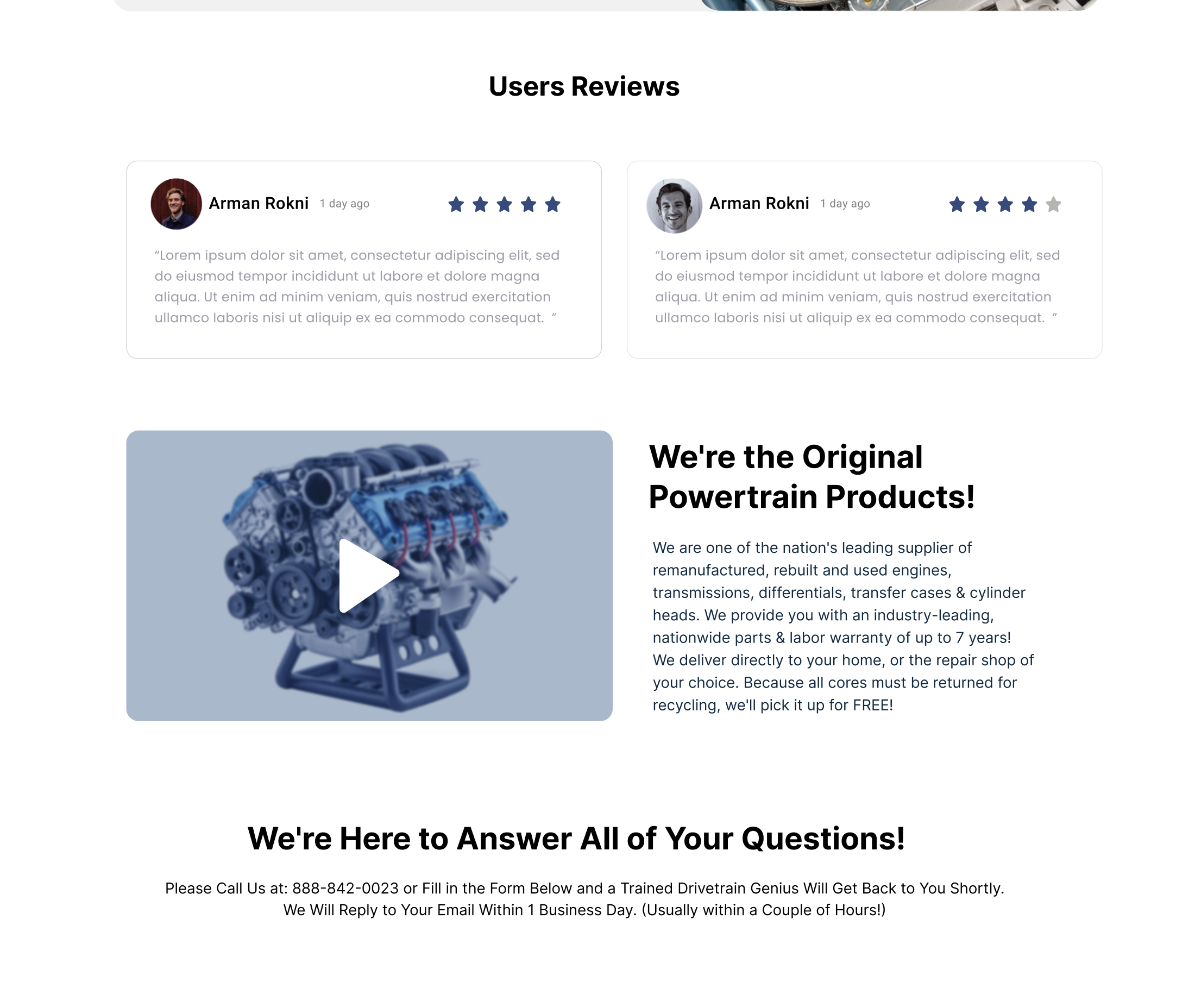
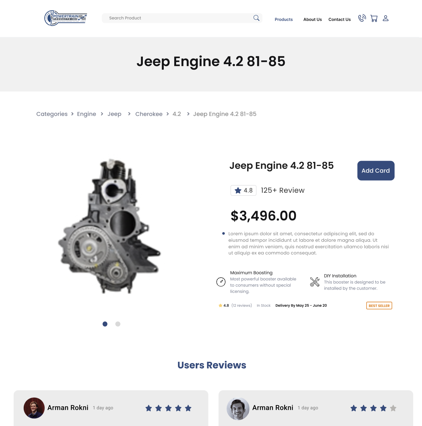
In the digital age, trust is a crucial currency, and PowertrainProducts.net’s redesigned product pages address this by incorporating verified product ratings and proof of authenticity. These elements play a pivotal role in building customer confidence in the quality and reliability of the products. Verified ratings offer prospective buyers honest feedback from other customers, helping them make informed decisions. By transparently showcasing the quality and genuineness of its products, Powertrain Products not only affirms its commitment to excellence but also fosters a sense of trust and reliability among its customers.
Balanced Presentation of Product Information
The product pages on PowertrainProducts.net strike a perfect balance between providing comprehensive information and maintaining simplicity. Each product page is designed to present detailed descriptions, specifications, and features in an easily digestible format. This approach ensures that customers have all the information they need to make an informed purchase without feeling overwhelmed. Additionally, the redesigned pages smartly incorporate upselling and cross-selling techniques. These recommendations are subtly integrated, offering customers options for similar higher-quality products or complementary items that enhance their purchase. This strategy not only improves the shopping experience but also potentially increases the average order value.
Boosting Conversions with Sticky Add-to-Cart
In the pursuit of enhancing user convenience and boosting conversion rates, PowertrainProducts.net’s redesign introduces the ‘Sticky Add to Cart’ feature – a small but mighty tool in the e-commerce arsenal. This feature keeps the Add to Cart button constantly visible and accessible, regardless of how far down the page a customer scrolls. It’s akin to a personal shopping assistant, consistently present and ready to expedite the purchasing process at a moment’s notice. This unobtrusive yet ever-present button significantly streamlines the shopping experience, reducing the effort required to make a purchase decision.
The integration of the Sticky Add to Cart feature into PowertrainProducts.net has been meticulously executed to ensure it aligns seamlessly with the site’s overall design. It’s an example of how small, thoughtful enhancements can have a big impact on the customer journey. By removing friction in the path to purchase, this feature has shown a notable increase in order completion rates. It demonstrates how simplifying the buying process can be a decisive factor in converting browsers into buyers.
Navigating the Future with a Redesigned PowertrainProducts.net
As we conclude our exploration of PowertrainProducts.net’s comprehensive redesign, it’s clear that this transformation transcends mere visual appeal. Each aspect of the redesign, from interactive hover effects and Quick View options to the efficient use of high-quality images, has been strategically crafted to enhance the customer experience and streamline the purchasing journey. The introduction of the Sticky Add to Cart feature further underscores Powertrain Products’ commitment to providing a seamless and efficient shopping experience.
PowertrainProducts.net’s journey is a beacon for businesses contemplating the impact of a website redesign. It demonstrates that keeping pace with digital trends is not just about aesthetic updates; it’s about fundamentally improving how customers interact with your brand online. In today’s digital age, a website is a key touchpoint for building relationships with customers, and Powertrain Products sets an exemplary standard in this regard.
For businesses looking to embark on their own digital transformation, PowertrainProducts.net serves as an inspiration. If you’re ready to take your website to the next level and want to learn more about how a redesign can benefit your business, we invite you to contact us. Join us in driving forward with digital excellence.


