In the dynamically evolving digital landscape, standing out becomes a quest. Industrial Ladder & Supply Co., a venerable entity providing a broad spectrum of industrial tools and equipment, found itself amidst this quest, seeking a digital presence that mirrored its intrinsic values and versatile offerings. Their old website was a mere silhouette of their expansive inventory and their dedication to safety and quality in the industrial realm. The mission was clear: sculpt a website that not only elucidates their prolific offerings but also crafts an intuitive, trustworthy, and user-centric digital experience.
The Essence of Strategic Website Redesign
A website is far more than a digital catalog; it’s a narration of a brand’s story, values, and promises, intertwining them with a functional and aesthetically pleasing user experience. As technology gallops forward, the virtual storefront, Industrial Ladder & Supply Co., Inc., needed a robust, sophisticated, and, above all, effortlessly navigable website. It wasn’t merely about visual appeal but intertwining the utility with a visually coherent narrative.
A. Setting the Stage: What’s at Stake with an Outdated Design
An outdated website can inadvertently communicate a lack of innovation or adaptability, potentially dwindling customer trust and engagement. It isn’t about keeping up with digital trends, but ensuring that every visitor effortlessly finds what they’re seeking, experiences the brand’s essence, and navigates through a secure and swift digital environment. The evolution from a static digital presence to a vibrant, interactive, and user-oriented platform isn’t a mere upgrade; it’s a fundamental shift towards putting customer experience at the forefront.
B. Establishing a Brand Image Online
For Industrial Ladder & Supply Co., Inc., a company that prides itself on offering a vast array of quality products, from ladders and scaffolds to specialized contractor tools, articulating this multitude and quality online was pivotal. The redesign wasn’t just about better aesthetics but ensuring that each pixel, each layout choice, mirrored their dedication to quality, safety, and variety, directly embedding their brand image into the user’s digital journey.
C. Balancing Aesthetics and Functionality
A strategic redesign seamlessly marries aesthetics with functionality. While beautiful visuals captivate visitors, underpinning them with an intuitive and straightforward functionality ensures that this interest is not fleeting. Every interactive element, every image, and every piece of content should serve a dual role: to enchant and to guide, ensuring visitors are not left in a digital labyrinth but are on a clear, discernible path, leading them to what they seek.
D. Leveraging Redesign to Address Specific User Needs
Addressing user needs isn’t merely about facilitating them to find products swiftly; it’s about crafting an environment where their needs, anticipated and current, are met with minimal friction. The redesign focused on understanding the clientele, their browsing habits, purchasing patterns, and potential queries, and embedding solutions within the digital structure. It’s about foreseeing the hurdles a user might encounter and eradicating them before they become a stumbling block.
Navigating the Homepage Overhaul
A. Casting the First Impression
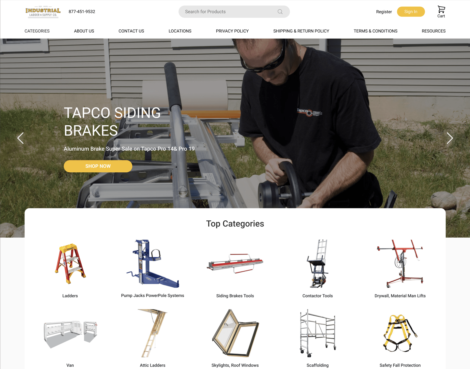
The homepage is essentially the digital doorstep to Industrial Ladder & Supply Co., Inc., greeting every visitor with an embodiment of its brand ethos, product spectrum, and unwavering commitment to quality. The redesigned homepage needed to do more than simply showcase products; it required crafting an inviting, intuitive, and informative space where visitors felt guided, reassured, and engaged.
B. Unveiling the Story through Banners
Banners, when employed strategically, can act as vivid storytellers, narrating the brand’s journey, commitment, and offerings through compelling visuals and succinct texts. The homepage overhaul introduced a header banner, not merely as an advertising space but as a dynamic segment, where the brand’s various facets, from its diverse inventory to time-sensitive offers, could be interwoven with user navigation, guiding them through their journey.
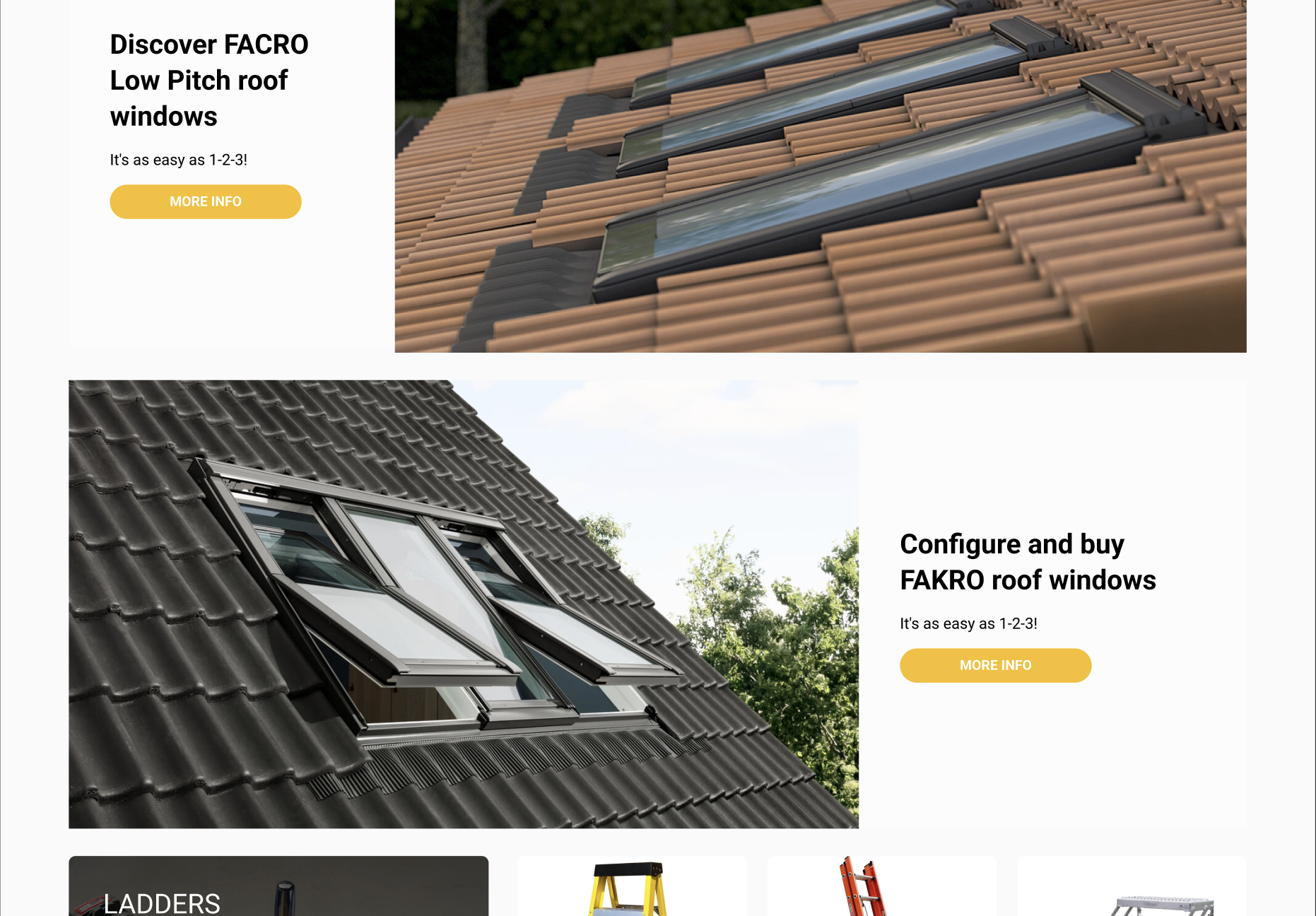
C. Interactive UI: A Symbiosis of Engagement and Trust
Embracing a user interface that was both modern and interactive didn’t merely upgrade the visual appeal. It subtly communicated a message of being in sync with current trends and consumer expectations, thereby fostering trust. With crisp visuals, straightforward navigation, and interactive elements, visitors are not only engaged but are effortlessly navigated through the extensive offerings, reinforcing the brand’s reliability and customer-centric approach.
While simplicity in design exudes sophistication, it also ensures that the user’s journey is free from potential friction caused by over-complicated elements. Maintaining a clean and straightforward design, the homepage became a fluid space where visitors could glide from one section to another, absorbing information, exploring products, and inevitably understanding the brand, all without feeling overwhelmed or lost.
Mega Menu: Enhancing Navigation and Clarity
A. Why Mega Menus Beat Traditional Drop-Downs
When dealing with an extensive product catalog like that of Industrial Ladder & Supply Co., Inc., traditional drop-down menus may falter, becoming clunky and disorienting. The mega menu emerges as a hero, providing a clear, clean, and organized navigation system that effortlessly categorizes and presents the wide array of offerings without inundating the visitor.
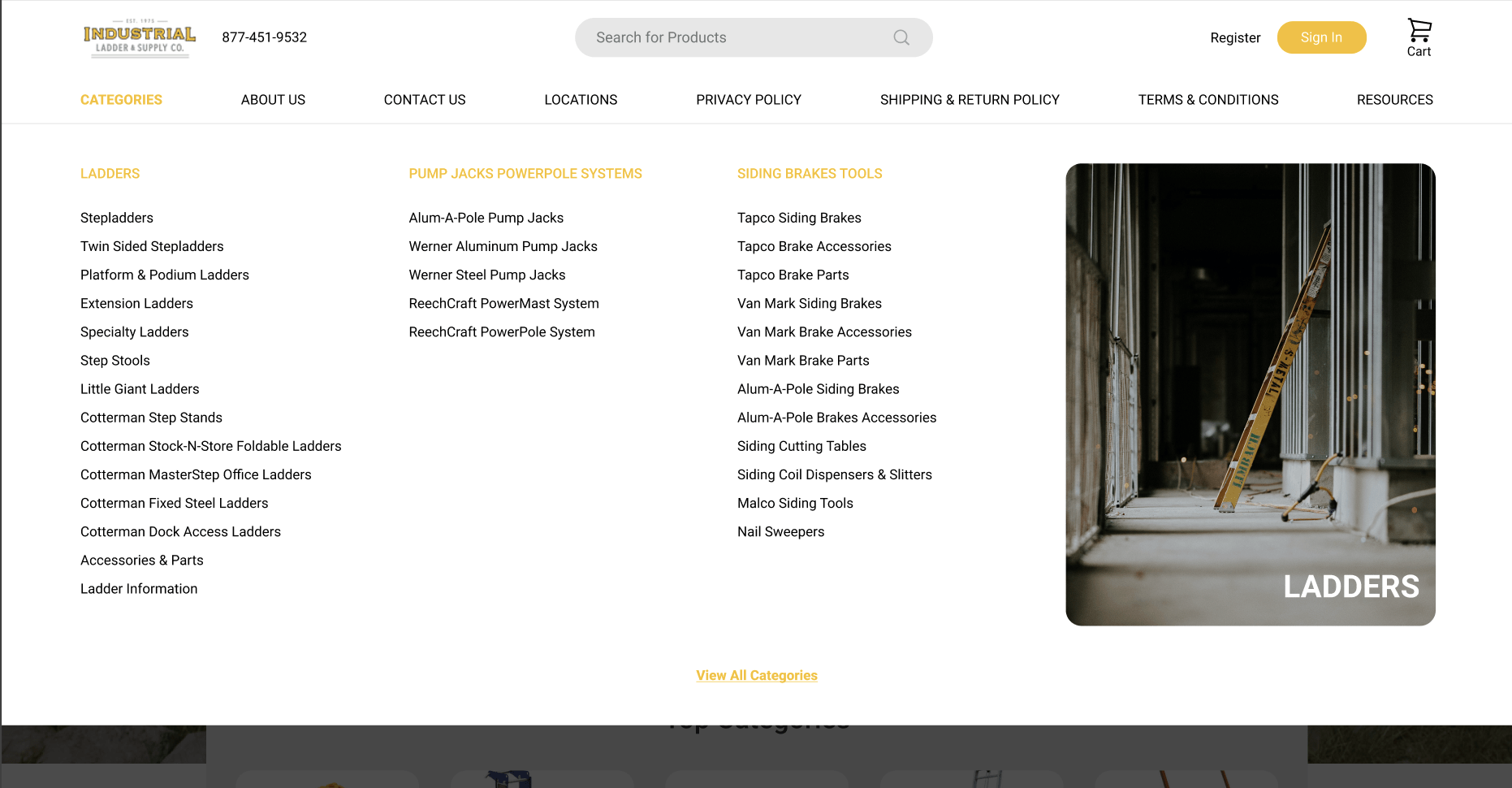
B. Sculpting User Paths through Organized Categorization
An intuitive mega menu, like the one sculpted in the redesign, doesn’t merely list options. It meticulously crafts pathways, guiding visitors through various categories, sub-categories, and highlighted products, thereby reducing navigation time and amplifying user satisfaction. It became a tool through which visitors, whether seasoned or novice, could understand, explore, and navigate the company’s diverse offerings with utter simplicity and zero stress.
C. Focusing on User Intention and Anticipated Needs
Beyond product listings, the mega menu was designed with a sharp focus on user intention and foresight into their potential needs. By strategically placing and highlighting certain products or categories, and by ensuring that each navigational path was coherent and logical, the menu transformed into a silent guide, subtly leading visitors towards their desired destination, or sometimes, a destination they didn’t realize they wanted to explore.
D. Balancing Visuals and Text for Optimal Clarity
Marrying visuals and text effectively in the mega menu ensures that navigation isn’t a sterile, functional task but an engaging and informative experience. Through clear categorization, concise descriptions, and inviting visuals, the mega menu became a vibrant, intuitive, and efficient navigational tool, effortlessly guiding visitors through the extensive industrial offerings without ever feeling cumbersome or overwhelming.
Refining the User Search Experience on Category Pages
A reshaped user experience on the category pages of Industrial Ladder & Supply Co., Inc. is underscored by the intuitive integration of a faceted search and an intelligent filtering system, both robustly enhanced to meet the variegated needs of diverse user demographics. The faceted search seamlessly intertwines with a user’s natural navigational habits, offering a path that is both logically and intuitively mapped, thus significantly easing product discovery.
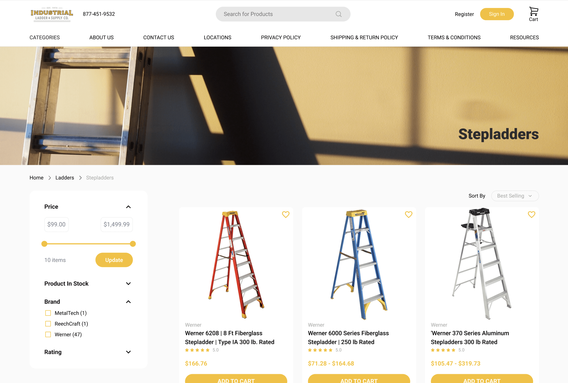
Meticulously, we’ve dovetailed this with a potent filtering system, amplifying user agency by allowing them to craft a browsing experience that is as broad or as nuanced as they desire.
Taking a stride further into the aesthetic and functional realms of the category pages, a symbiotic balance between visual appeal and operability was achieved, crafting a space where high-quality images, succinct descriptions, and clear pricing coalesce into an inviting and informative user experience.
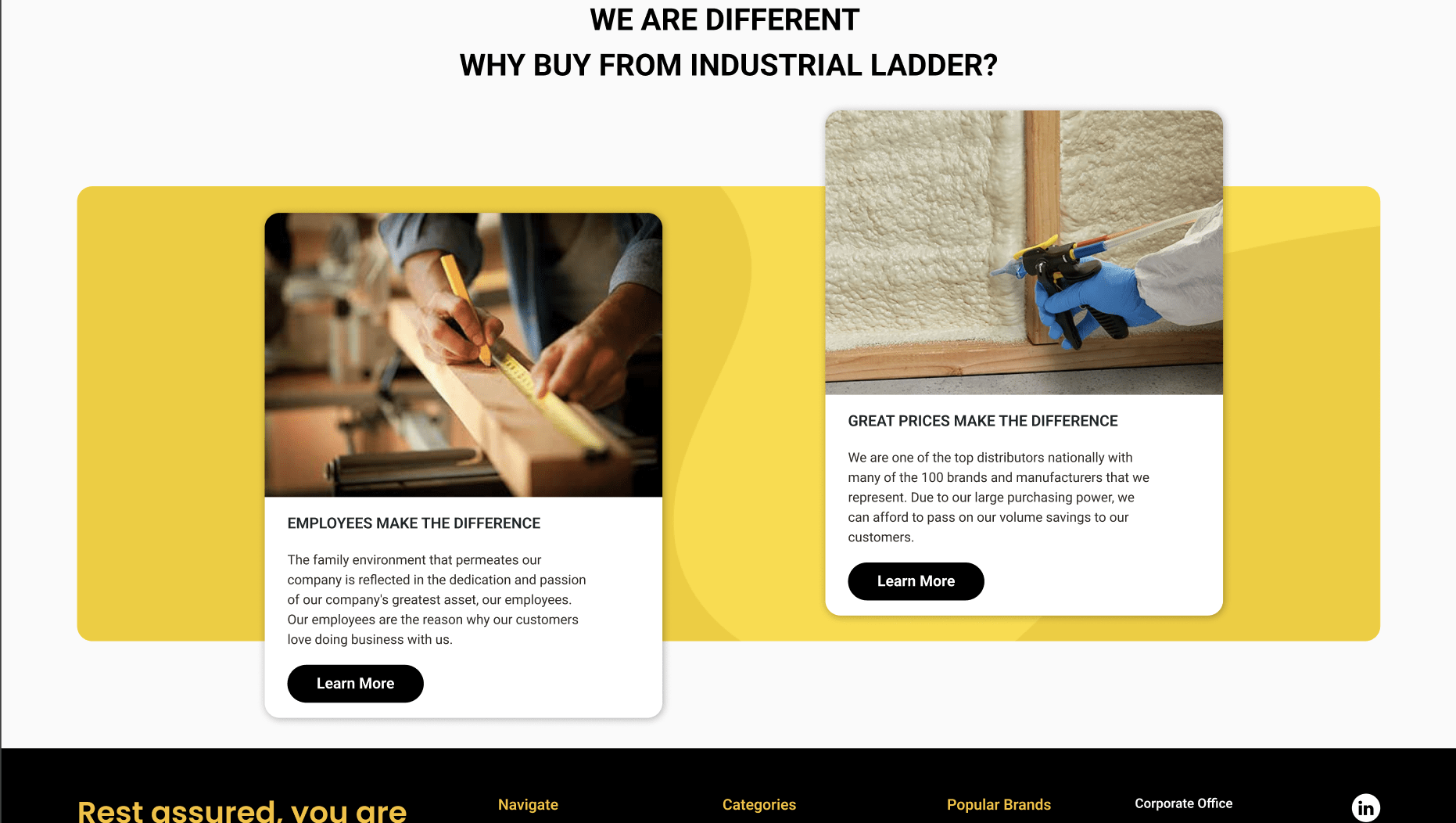
Every design element, from the visible to the operational, was infused with an ethos of interactive and inclusive design, ensuring the platform was not merely a transactional space but an engaging, comfortable, and user-affable digital environment.
Polishing Product Pages to Assure and Convert Customers
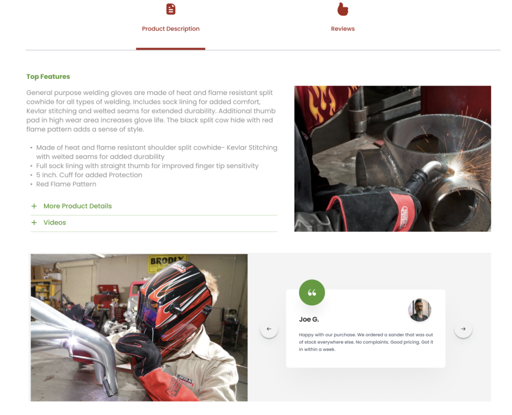
Embarking into the realm of product pages, the reinvention pivoted around strategically intertwining authenticity, clarity, and customer assurance into every pixel and string of text. Each product page, now adorned with verified ratings and tangible proofs, stands as a testament to the genuine quality and reliability that is paramount to Industrial Ladder & Supply Co., Inc., seamlessly marrying assurance with user conversion through transparent showcasing.
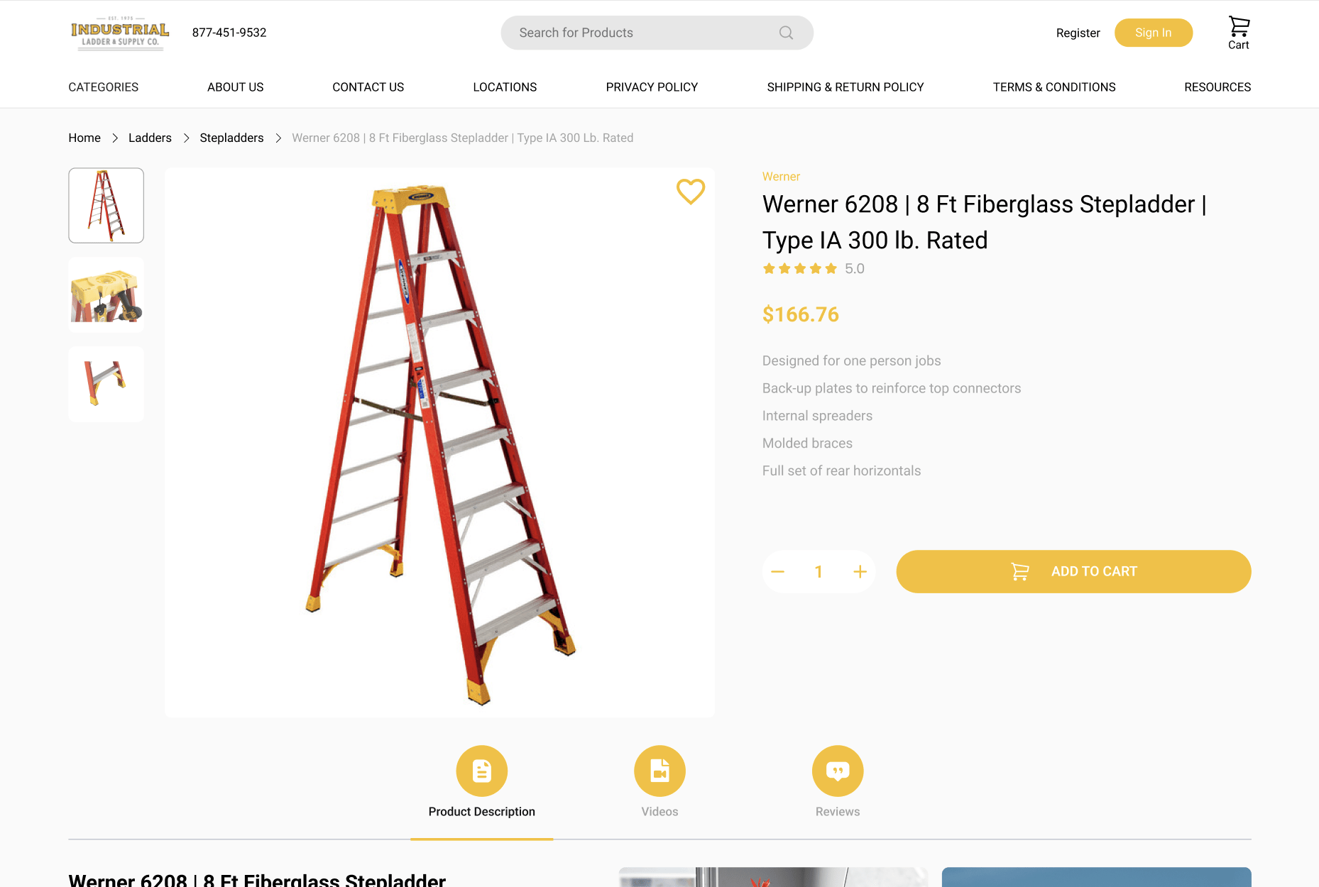
Navigating through the highlighted product features presents a journey where information is not merely consumed but experienced. Strategic spotlighting ensures that the customer is offered a perfectly balanced platter of essential details, not overwhelming yet adequately informative, orchestrating an informed decision-making process. Interweaved within this customer journey, intelligent algorithms subtly engage in up-selling and cross-selling, offering a seamless blend of primary product exploration with discoveries of complementary or superior products.
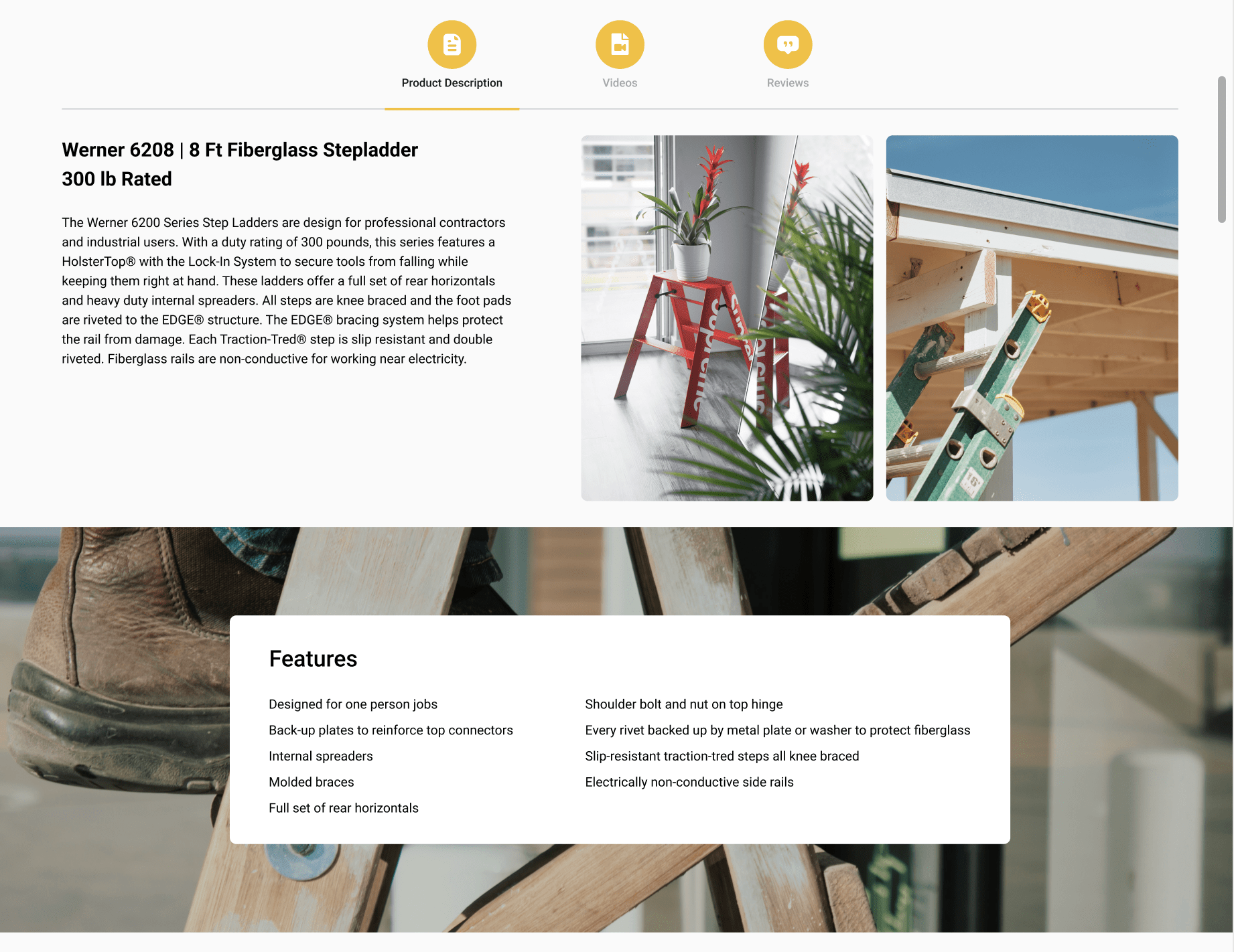
Each product page is, therefore, not just a space of transaction but an immersive experience, thoughtfully crafted and balanced, guiding the visitor from curiosity through assurance, to the final act of purchase. A journey where each step is enveloped with an undercurrent of trust, clarity, and enriched user engagement, thereby not just guiding but accompanying the user towards conversion.
Implementing Sticky Add to Cart for Sustained Conversion Rates
Introducing the Sticky Add to Cart feature transcends the traditional boundaries of user convenience and exemplifies a calculated stride toward sustaining conversion rates for Industrial Ladder & Supply Co., Inc. This constant, mobile companion travels with the user as they explore the product depths, persistently offering a gentle, nonintrusive reminder of their tentative choices and thereby, subtly maintaining a connection with the inherent purchasing intention.

As users delve deeper into product descriptions, reviews, and specifications, the sticky add-to-cart button stands resiliently by their side, ensuring the pathway to purchase is perpetually within arm’s reach, eliminating potential drop-offs that may occur due to the inconvenient toggling between product exploration and the final commitment to purchase. Its silent persistence thus eloquently meshes convenience with a gentle nudge towards conversion, anchoring the purchasing thought amidst the seas of exploration and consideration.
Measurable Impacts of the Redesign
As the digital curtains rise, revealing the meticulously redesigned website of Industrial Ladder & Supply Co., Inc., the impacts extend far beyond the visual tapestry and dive deep into the tangible realms of user engagement, retention, and conversion. The homepage, now a symphony of strategic banner placements, user-intuitive design elements, and a vibrant yet comfortingly familiar visual narrative, not only welcomes but also subtly guides the user through a journey expertly crafted to entwine discovery with decision-making.
The mega menu, a nod to both clarity and user agency, has transformed the navigational experience from a mere utility to a journey of discovery, effortlessly guiding users through the myriad offerings while simultaneously spotlighting key products and categories. The category and product pages, meanwhile, stand as pillars of trust and assurance, interweaving verified ratings, transparent information, and subtle cross-selling and up-selling nudges to weave a path that guides the user from curiosity to confident purchase.
The translation of this comprehensive redesign into measurable metrics reverberates through the enhanced user dwell time, reduced bounce rates, and notably, an upliftment in conversion rates. The latter, a testament to the symphonic balance of strategic, aesthetic, and functional elements, each whispering the brand’s assurance and quality into the user’s journey, thereby not merely constructing but elevating the path from first glance through to conversion.
Conclusion
In the vast expanse of the digital realm, where clicks and cursors pave pathways to potential conversions, the dynamic redesign journey of Industrial Ladder & Supply Co., Inc. stands not just as a testament but as a tangible reflection of strategic digital metamorphosis. Navigating through the intertwining threads of user experience, functional clarity, and aesthetic resonance, the holistic transformation journey articulates an eloquent narrative, blending technology and human-centric design into a seamless tapestry of interactive storytelling.
Your Journey Awaits…
Embarking on a similar journey of digital transformation is not merely a step but a leap towards intertwining your brand’s story with the dynamic narratives of user experiences, crafting a digital realm where your offerings and their needs meet, converse, and converge into meaningful interactions and transactions.
Your website is not just a platform; it’s a narrative, a story waiting to be told, heard, and experienced in the vast digital landscape. Industrial Ladder & Supply Co., Inc. has embarked on their journey, weaving their brand into the digital narratives of countless users. Now, it’s your story that awaits to be told, your brand that awaits to resonate across the screens and into the lives of your audience.
Elevate Your Digital Presence with Us!
Embark on your own journey of digital transformation with a partner who doesn’t just understand the technological nuances but appreciates the delicate art of crafting user experiences. Let’s elevate your digital story together, sculpting each pixel, each interaction, to resonate with your brand’s essence and their expectations.
Connect with Us
Your journey towards a meticulously crafted digital identity begins with a conversation. Contact us to explore, envision, and embark on your path towards a digital presence that doesn’t just speak but resonates, guides, and gracefully leads each user from curiosity to conversion, and beyond.


