In an era where digital storefronts are as crucial as their physical counterparts, the significance of a well-designed website cannot be overstated. Fenix Store, a trailblazer in the retail of Fenix products, is no stranger to this truth. Established in 2006, Fenix Store has not only witnessed the evolution of e-commerce but has actively adapted to these changes to maintain its position as the oldest and largest brand-authorized retailer of Fenix products globally. In 2023, embracing the constant change, Fenix Store embarked on a transformative journey – a complete redesign of its website, fenix-store.com. This endeavor was not just about aesthetic enhancement; it was a strategic move to align with the evolving expectations of modern consumers and to consolidate their position in an increasingly competitive market.
The impetus for this redesign was rooted in a simple yet profound understanding: In the digital world, your website is your identity. It’s often the first and sometimes the only interaction customers have with your brand. Recognizing this, the redesign of fenix-store.com was approached not just as a task but as an opportunity to redefine and strengthen the brand’s online presence. This article delves into the nuances of this redesign, exploring how each element contributes to creating a more engaging, trustworthy, and user-friendly online experience. It serves as a beacon for businesses contemplating the journey of digital transformation, illustrating the importance and benefits of staying current and responsive to the ever-changing digital landscape.
The Power of First Impressions: Homepage Redesign
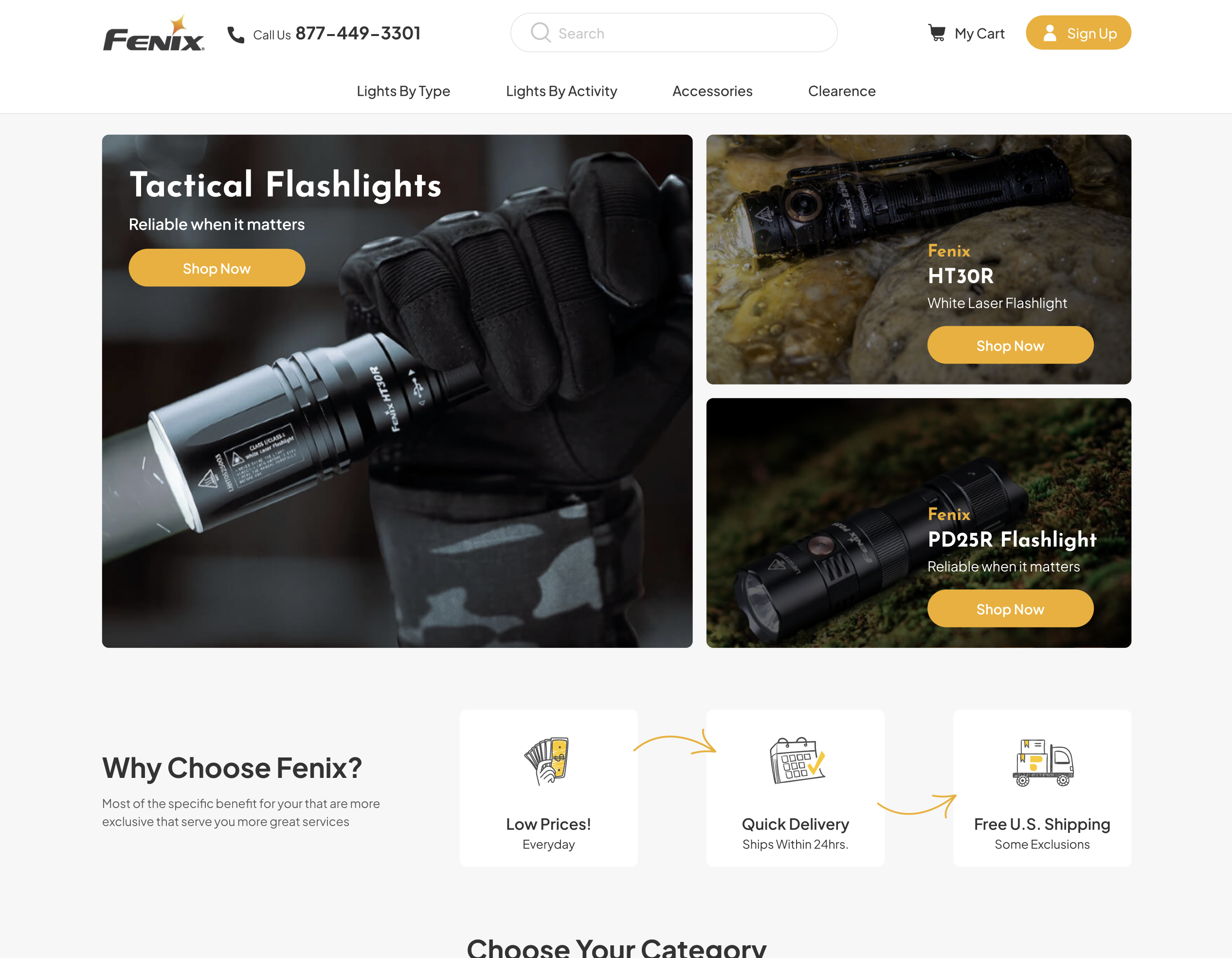
The homepage of fenix-store.com greets visitors with a striking header banner – a digital billboard that encapsulates the essence of the brand. In the world of online retail, first impressions are pivotal. This header banner is more than just an image; it’s a narrative device that tells the Fenix story at a glance. By setting forth a clear brand identity and personality, the banner not only captures attention but also builds an instant connection with the visitor. In a landscape crowded with competitors, this immediate engagement is crucial for standing out and drawing the customer further into the website.
Enhanced User Interface
The redesigned user interface (UI) of fenix-store.com is a testament to the brand’s commitment to customer-centricity. This modernized UI is designed to elevate customer engagement and foster trust. By moving away from outdated, text-heavy layouts, the website now offers a visually appealing and intuitive experience that resonates with contemporary user expectations. The new design emphasizes ease of navigation and clarity, allowing customers to find what they need quickly and effortlessly. This shift not only sets Fenix Store apart from competitors but also aligns with the broader trend of simplification in web design, where less is more, and clarity is king.
Simplified Design and Clear Messaging
In line with the principle of simplicity, the redesign focuses on streamlined interfaces and clear language. The goal is to eliminate any potential confusion that could arise from overly complicated designs or convoluted messaging. This approach is particularly effective in communicating the value of Fenix products, where the emphasis is on quality and innovation. By distilling content to its most essential elements, fenix-store.com ensures that the message about its products is not lost in translation but is delivered succinctly and effectively.
Banner Ads and Their Impact
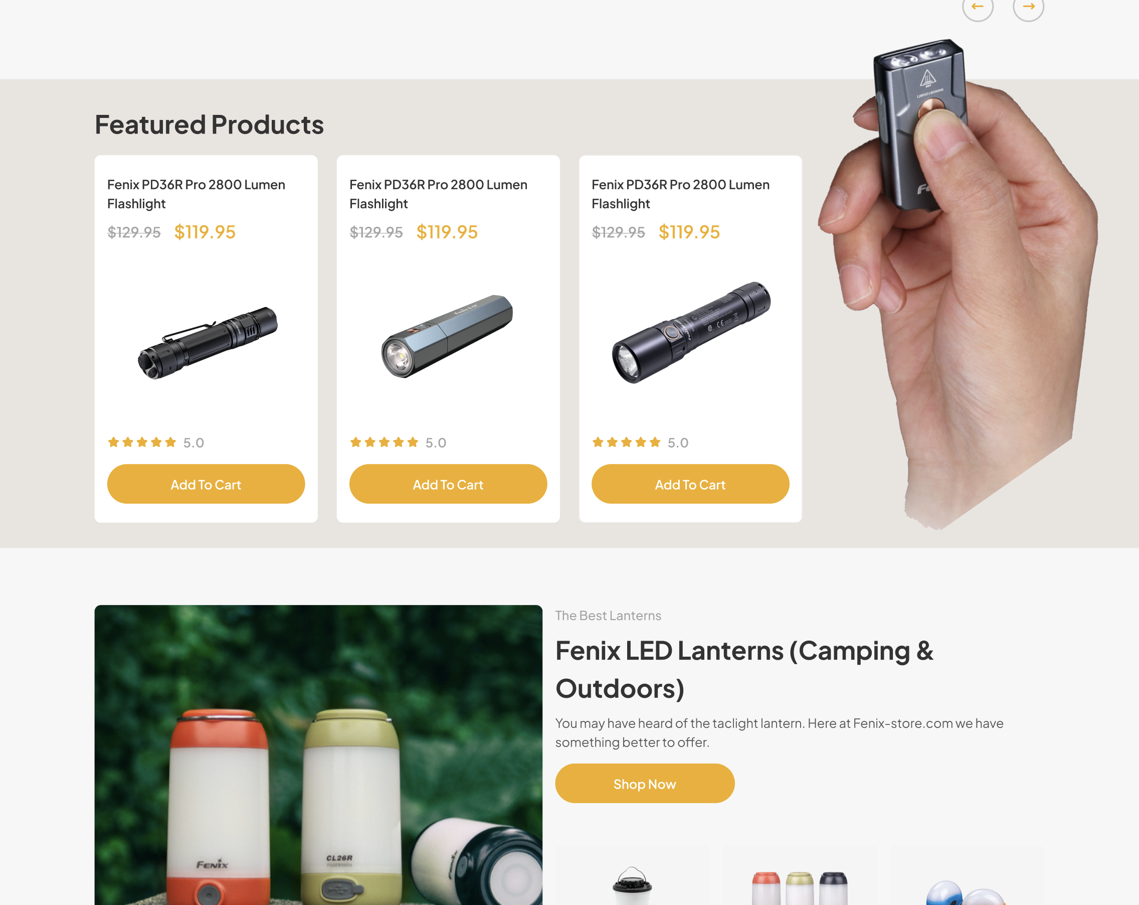
Banner ads on the website serve a dual purpose: they act as a conduit for promoting specific products or offers and as a tool for reinforcing the brand narrative. By strategically placing these ads, Fenix Store leverages its potential as a measurable and effective medium to enhance brand awareness and drive conversions. The redesign ensures that these ads are integrated seamlessly within the website’s layout, maintaining aesthetic harmony while effectively catching the user’s eye.
Accessibility and User-Friendly Navigation
A key focus of the redesign was to ensure that fenix-store.com is accessible to every type of user. This commitment to inclusivity means that the website is not just visually appealing but also navigable by people with diverse abilities and preferences. Attention to accessibility details like color contrast, font size, and keyboard navigation ensures that the site is welcoming to all, reflecting Fenix Store’s dedication to serving a broad customer base.
Highlighting Value Propositions
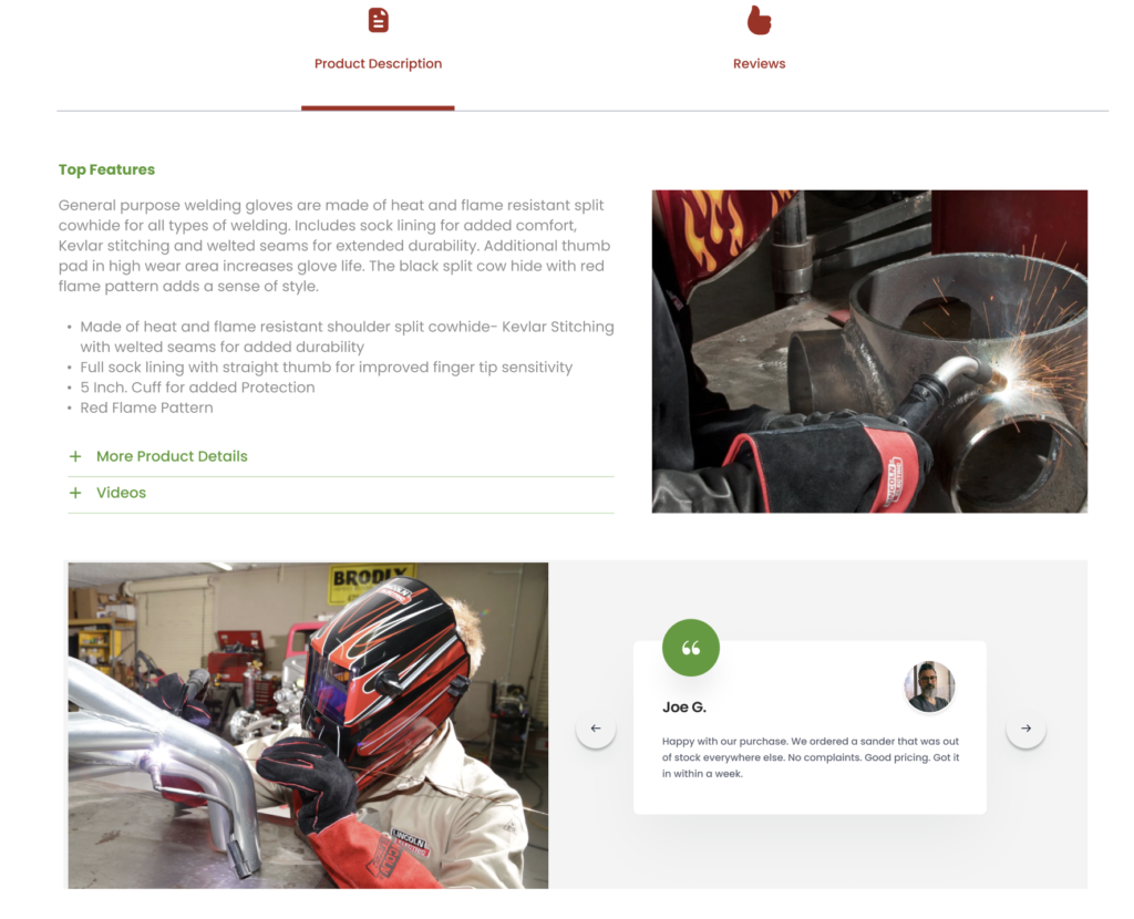
In the competitive world of e-commerce, it’s not enough to just list products; it’s crucial to showcase their value. The redesign of fenix-store.com brings the brand’s value propositions to the forefront. Phrases like “High Quality,” “50% Off,” or “Limited Time Offer” are prominently displayed, immediately drawing the visitor’s attention.
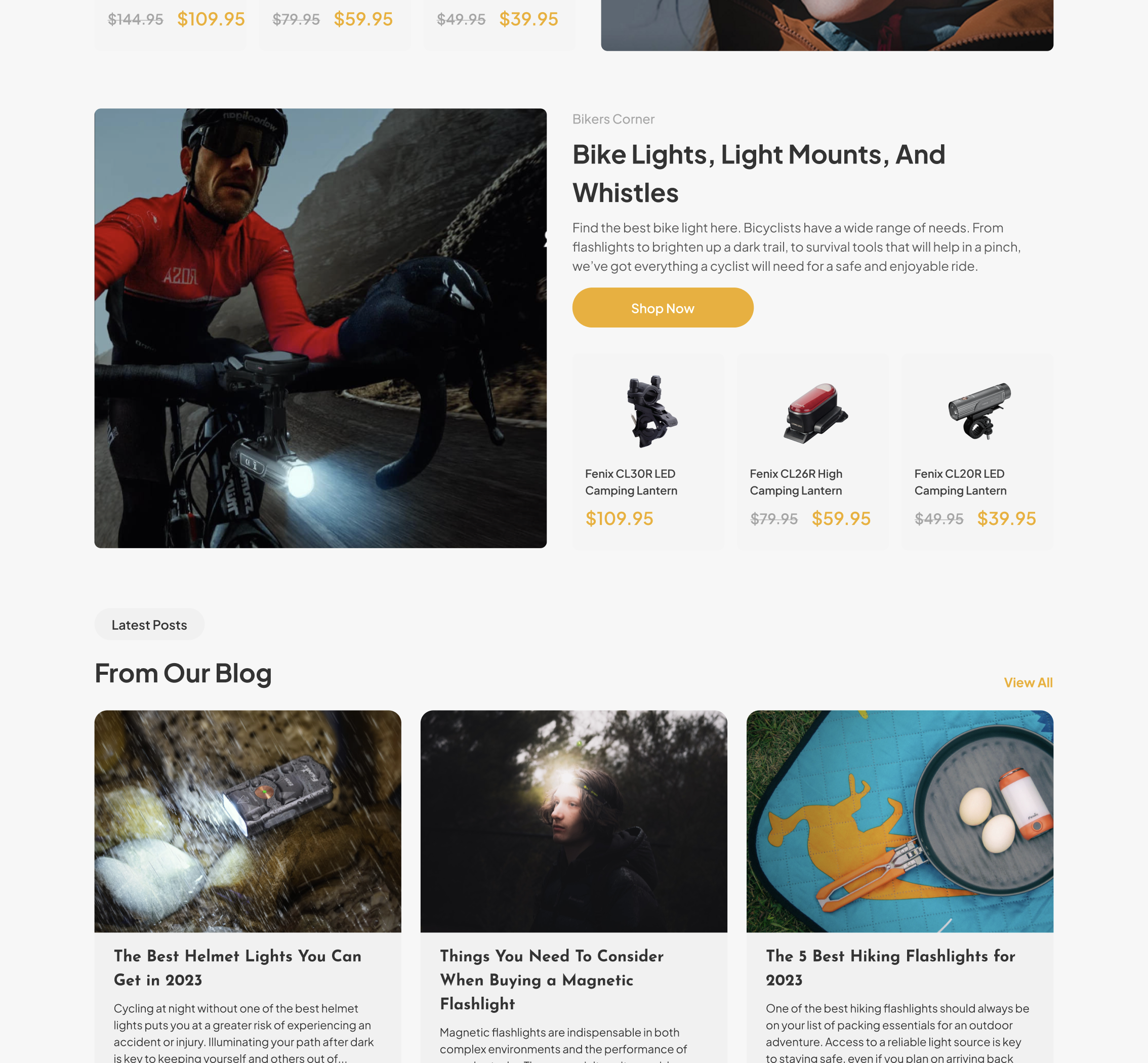
These value propositions are more than just marketing statements; they are a commitment to the customer, a promise of quality and affordability that Fenix Store stands behind.
Enhancing Interaction: Quick View and Hover Effects
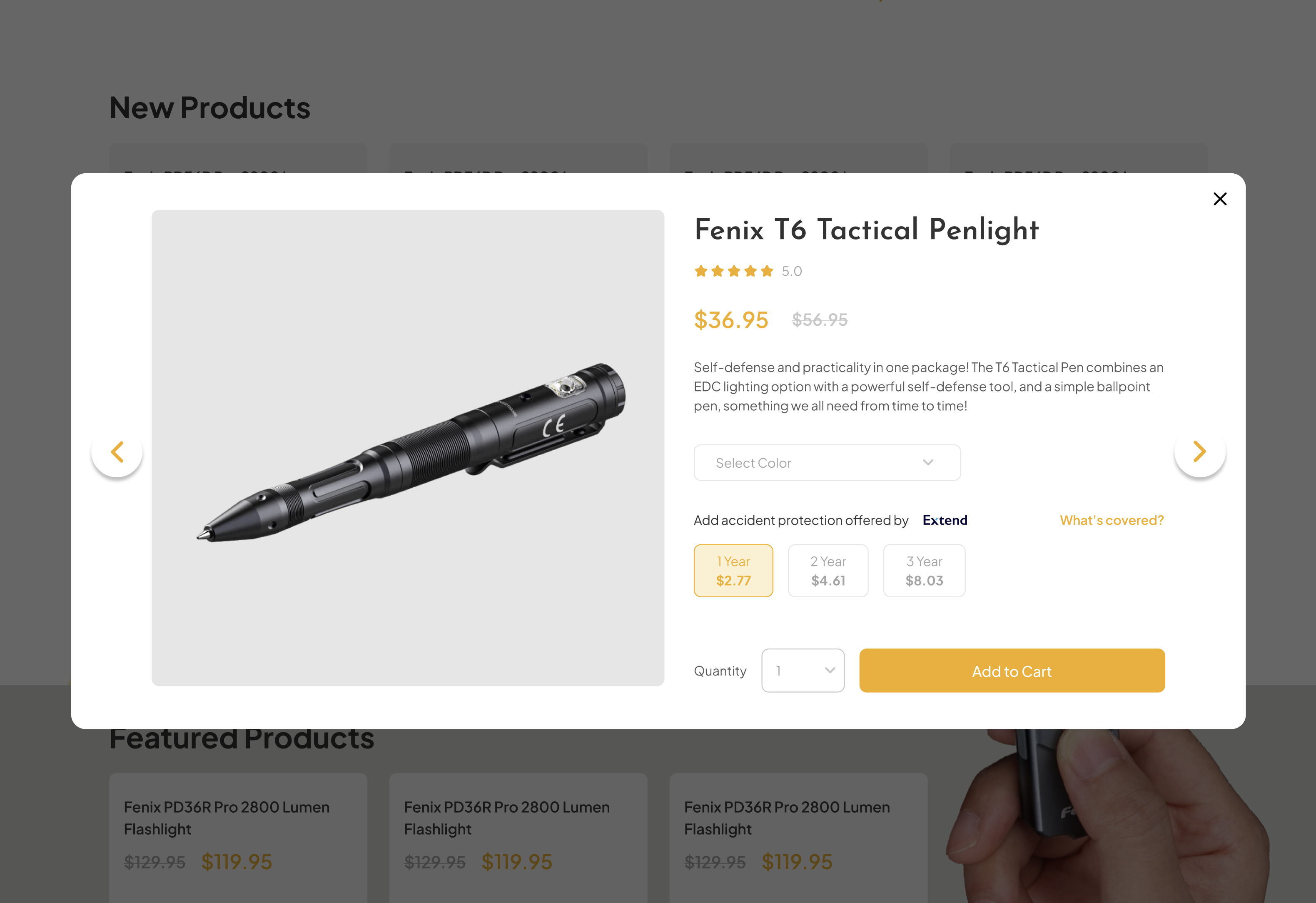
In the redesign of fenix-store.com, special attention was given to interactive elements like hover effects. These subtle yet powerful tools play a significant role in enhancing user engagement. When a user hovers over a product or a link, the element responds – it might change color, enlarge, or animate. This not only adds a layer of interactivity to the browsing experience but also guides the user’s attention to key items and actions. It’s akin to a helpful salesperson in a physical store pointing out interesting products. This feature demonstrates that the website is responsive and attentive to user input, making the browsing experience more enjoyable and engaging.
Benefits of Quick View Functionality
The introduction of Quick View functionality is another pivotal aspect of the redesign. In the fast-paced digital shopping world, efficiency is key. Quick View allows users to see product details at a glance without navigating away from their current page. This is particularly beneficial for customers who are comparing multiple items or who prefer a streamlined shopping experience. It reduces the time and effort needed to browse, select, and purchase products. By minimizing the number of clicks and pages a user must navigate, Quick View significantly enhances the user experience, potentially leading to higher engagement and conversion rates.
Navigating with Ease: Mega Menu Implementation
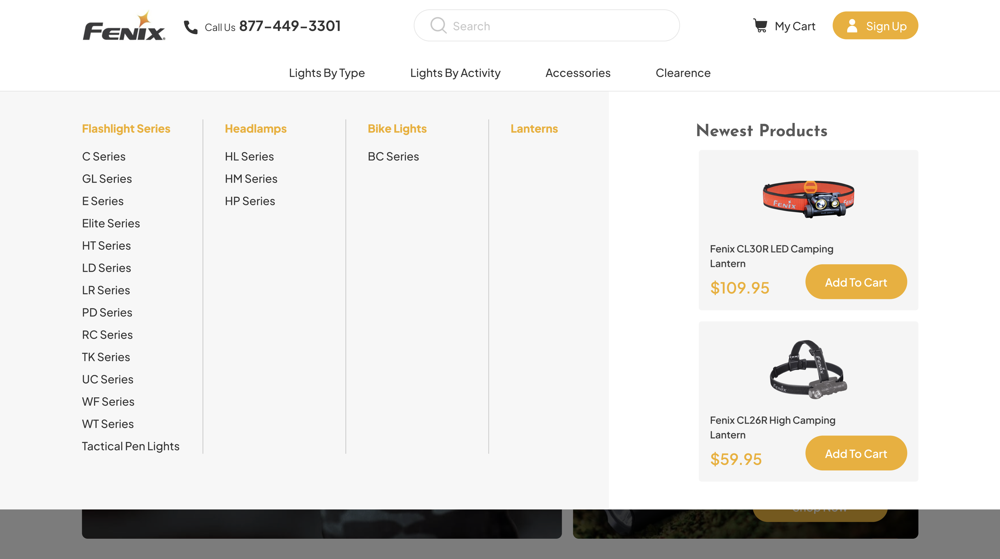
The introduction of a mega menu in the redesign of fenix-store.com represents a significant improvement in site navigation. A mega menu is particularly advantageous for e-commerce sites with a wide range of products and categories. Unlike traditional dropdown menus, which can become cumbersome and overwhelming with too many options, mega menus present information in a more organized and accessible format. This helps users quickly find what they’re looking for, improving their overall experience. The mega menu at Fenix Store not only simplifies navigation but also showcases featured products and promotions, effectively guiding customers towards items of interest and enhancing discoverability.
Mega Menus as a Clutter-Reducing Tool
The mega menu also plays a crucial role in decluttering the website. By providing a comprehensive view of all available categories and products at a glance, it reduces the need for excessive menu items on the main page. This contributes to a cleaner, more focused user interface, allowing customers to navigate the site with ease. Moreover, the mega menu can be used to promote relevant products and special offers directly within the navigation experience, subtly influencing purchasing decisions without overwhelming the user.
In these sections of the redesign, fenix-store.com demonstrates how updating navigational elements and interactive features can significantly enhance the user experience. The introduction of hover effects, Quick View functionality, and a mega menu are not just about keeping up with current web design trends; they are about anticipating and catering to the needs and behaviors of modern consumers. For any outdated website, these changes underscore the importance of evolving to meet user expectations, ensuring that the site remains effective, engaging, and competitive in a rapidly changing digital landscape.
Optimizing Product Discovery: Category Pages
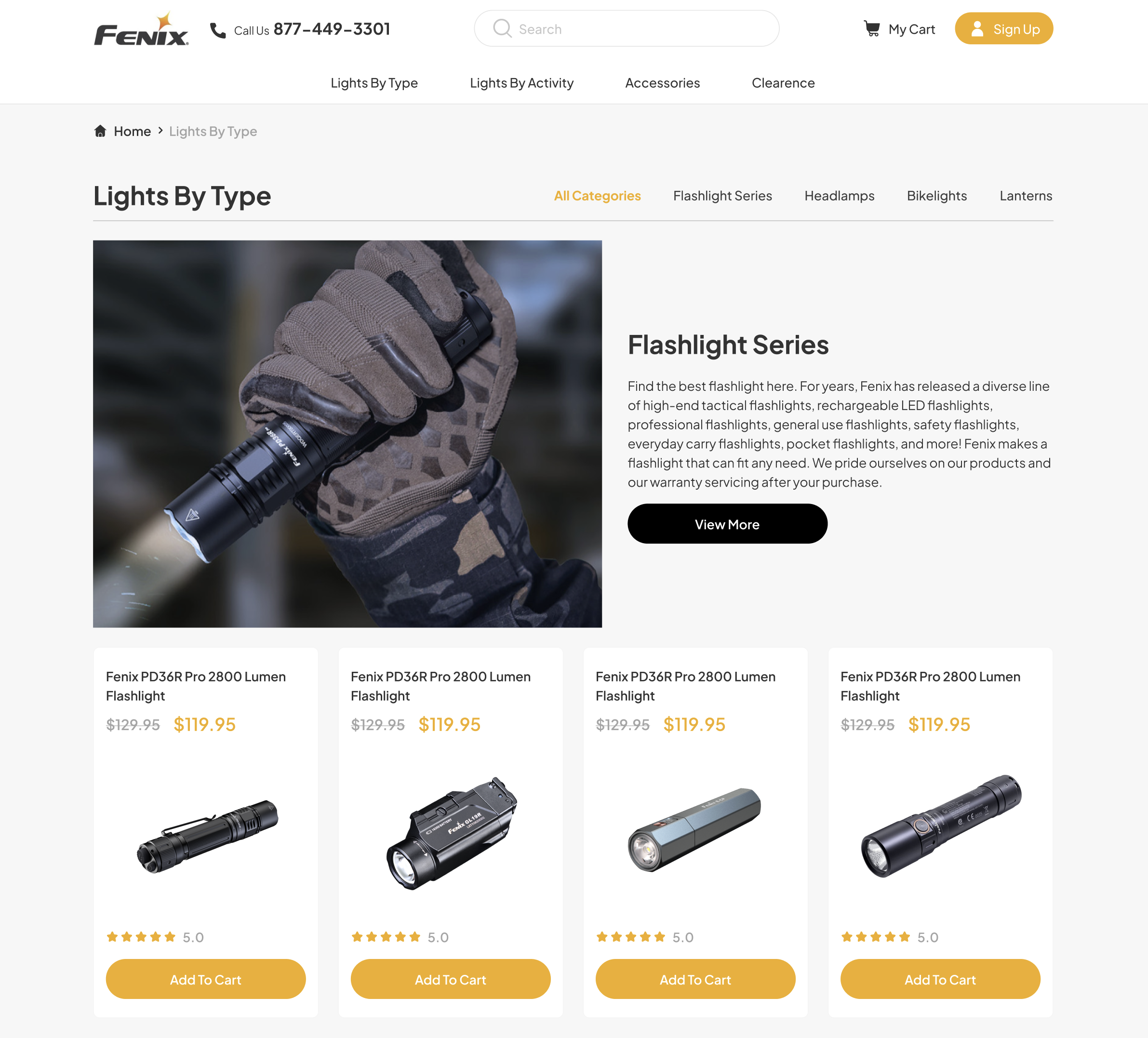
The redesign of Fenix Store’s category pages placed a significant emphasis on creating an interactive search interface. This is particularly crucial in e-commerce, where efficient and user-friendly search functionality can greatly influence customer satisfaction and conversion rates. An interactive search interface allows users to find what they’re looking for with ease, making their shopping experience smoother and more enjoyable. By enabling customers to quickly locate products, the website effectively mimics the convenience of asking a knowledgeable store associate in a physical store. This feature not only enhances user engagement but also encourages exploration within the site, potentially increasing the likelihood of additional purchases.
The Power of Filtering Systems
Incorporating a robust filtering system is another critical aspect of the category page redesign. This is especially important for a website like fenix-store.com, which boasts a diverse range of products. Effective filters allow users to narrow down their options based on specific criteria, such as price, category, or product features. This not only improves the shopping experience by making it more personalized but also helps users navigate a large inventory with ease. A well-designed filtering system can significantly boost user experience (UX), widen the reach to different customer segments, and subsequently, increase sales. In the digital realm, where time is of the essence, providing customers with tools to quickly find what they need is not just a convenience but a necessity.
Detailed and Trustworthy: Product Pages Revamp
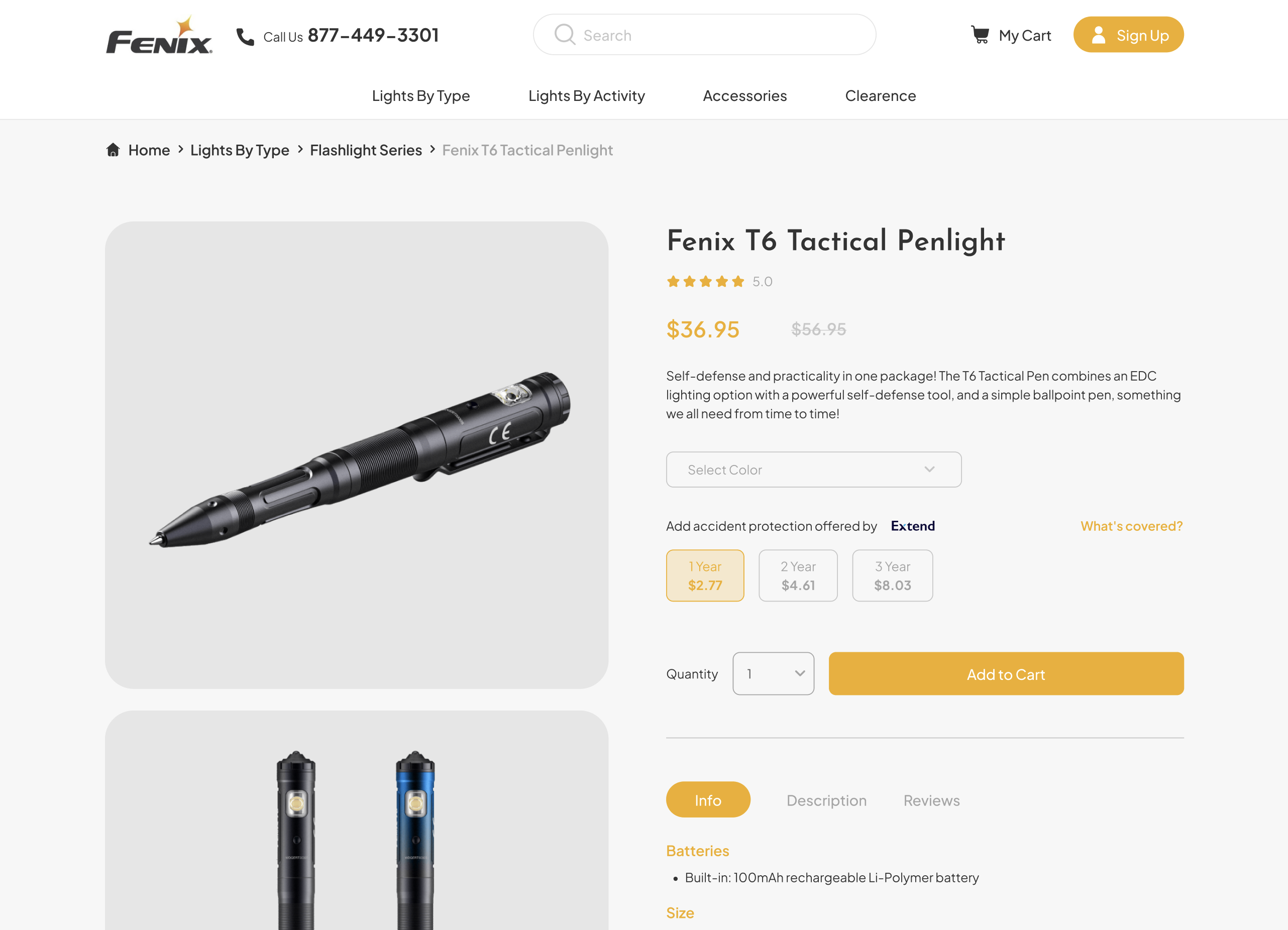
A notable enhancement in the product pages of Fenix Store is the addition of verified product ratings and authenticity guarantees. This feature plays a crucial role in building customer trust and confidence in the quality of the products offered. In an online shopping environment, where physical examination of products isn’t possible, these ratings and guarantees act as a seal of quality, reassuring customers about their purchase decisions. This transparency not only aids in building a loyal customer base but also helps in distinguishing Fenix Store from other competitors who may not provide such clear assurances about their products.
Effective Presentation of Product Highlights
The product pages also underwent a transformation in how product features and highlights are presented. The goal was to convey the most important information in a clear, concise manner, without overwhelming the customer with too much detail. This approach aligns with the modern consumer’s preference for quick, easily digestible information. By striking a balance between informativeness and simplicity, the redesigned product pages facilitate a better understanding of the product, aiding customers in making informed decisions without the need for extensive research.
The redesign of Fenix Store’s website, particularly the category and product pages, demonstrates a deep understanding of modern consumer behaviors and preferences. These enhancements underscore the importance of user-centric design in eCommerce, where the ease of finding and learning about products can directly impact business success. For any website that feels outdated or underperforming, these changes serve as a reminder of the need for continuous evolution and adaptation to meet the ever-changing demands of the digital consumer.
The Sticky Add-to-Cart Feature: Boosting Conversion Rates
In the symphony of the Fenix Store redesign, a subtle yet powerful instrument plays a crucial role – the Sticky Add to Cart feature. This innovative element is akin to a persistent companion for the shopper, a constant yet unobtrusive presence that gracefully accompanies them as they journey through the website. The concept is simple yet profound: as the customer scrolls, exploring the depths of Fenix products, the Add to Cart button remains visible, a steadfast beacon guiding them towards decisive action. This feature is not just a tool; it’s a digital concierge, enhancing the customer experience by offering ease and convenience.

The Rhythm of Conversion: Measurable Impacts
The introduction of the Sticky Add to Cart feature is more than an aesthetic enhancement; it’s a strategic move, a rhythm in the dance of conversion rates. In the digital realm, where every second counts and every click matters, this feature significantly reduces the effort and time required to make a purchase decision. It’s about minimizing obstacles, about creating a seamless path from desire to acquisition. The results speak for themselves – an increase in orders by 8%, a testament to the feature’s effectiveness in not just engaging customers but in driving them towards a successful transaction.
Weaving a Digital Tapestry
The transformation of fenix-store.com from a conventional online storefront to a vibrant digital landscape marks more than a mere redesign; it signifies a renaissance in the e-commerce experience. This journey, rich in innovation and user-centric design, not only enhances the visual appeal and functionality of the website but also elevates the entire customer interaction with the Fenix brand. The culmination of this endeavor is not just a series of updates but a holistic experience that resonates with customers and drives business success.
For businesses still navigating the digital world with outdated strategies, the story of Fenix Store serves as both inspiration and a blueprint. It underscores the importance of continually evolving and adapting in a digital ecosystem that is constantly in flux. This transformation illustrates the potential of digital innovation to not only improve user experience but also to significantly impact conversion rates and brand loyalty.
In today’s digital age, where the landscape is as dynamic as it is competitive, the Fenix Store transformation stands as a testament to the power of embracing change. It serves as a reminder that in the realm of digital commerce, the journey towards innovation and adaptation is not just necessary; it is vital for survival and growth.
Are you inspired by the Fenix Store’s digital transformation and interested in exploring what a redesign could do for your business? Don’t hesitate to reach out and start a conversation about turning your website into an engaging, user-friendly, and successful digital platform. Contact us today to embark on your own journey of digital evolution and unlock the potential of your online presence.


