Your website is often the first impression that potential customers will have of your business. If your website looks outdated, it reflects poorly on your company as a whole. A modern design shows that you are keeping up with the times and are invested in your online presence.
In atlanticfirearms.com’s case, their old design had been in place for several years and was looking outdated. We redesigned it to optimize for higher conversion rates by developing easier navigation and better trust-building elements.
What We Did: The Importance of Modern Web Design
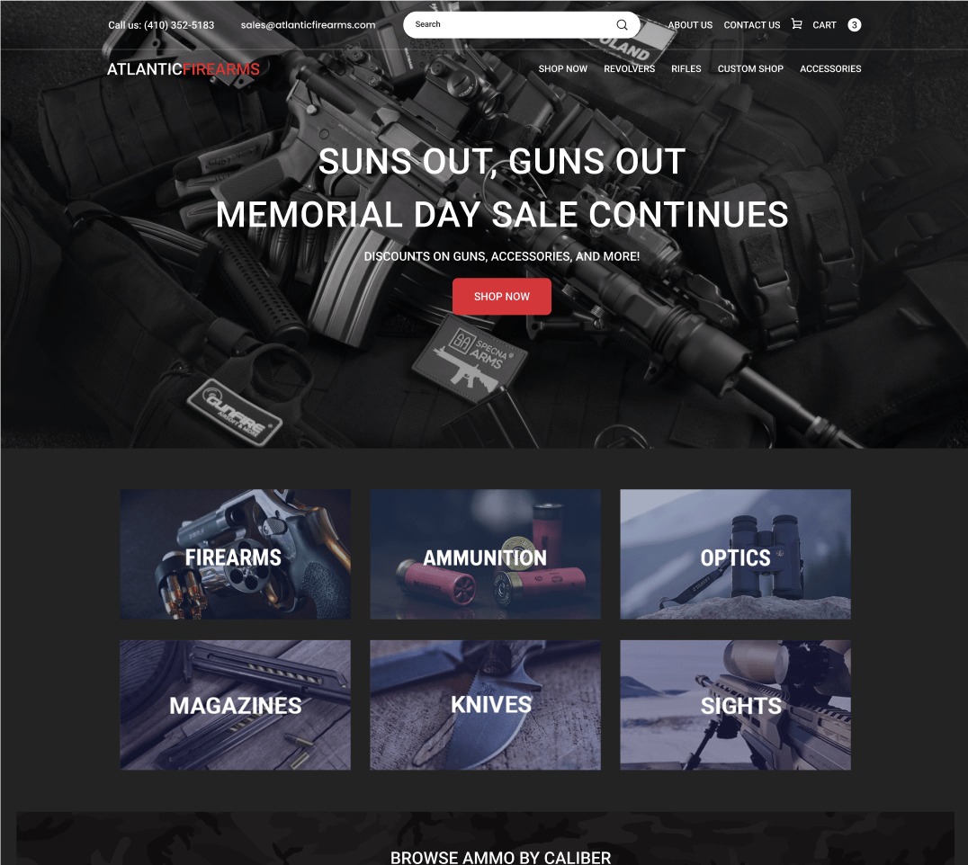
We updated the overall look and feel of the site to be more modern and inviting. The homepage was redesigned to be more user-friendly and conversion-focused.
We also added new features such as customer testimonials and social media integration to build trust with visitors. Our goals were to modernize the look and feel while still keeping the core functionality that their customers loved.
We wanted to make sure that visitors could easily find what they were looking for and that the most important information was front-and-center. With these objectives in mind, we:
- Simplified navigation
- Consolidated the top menu items
- Created a more intuitive drop-down menu system
- Addressed the layout of the homepage and individual product pages
Home Page
Creating a brand new home page interface will increase customer engagement and trust, and separate you from outdated websites. With interactive and good-looking UI designs, customers are more likely to stay loyal to your product and brand.
By increasing customer engagement with an interactive design, you create opportunities to increase sales and conversions, and encourage positive reviews/testimonials.
Creating a brand new home page also shows that you are keeping up with technology which can help you attract new customers as well.
Creating easier navigation helps customers to find what they are looking for faster without getting frustrated and leaving the site.
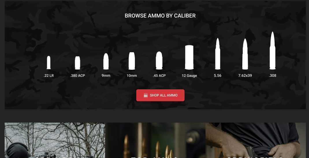
As you can see, we’ve made some major changes to the home page layout. The first thing you’ll notice is that we made it easier for customers to find the ammo caliber they want without getting confused and frustrated. This alone will increase the conversion rate drastically and decrease the bounce rate.
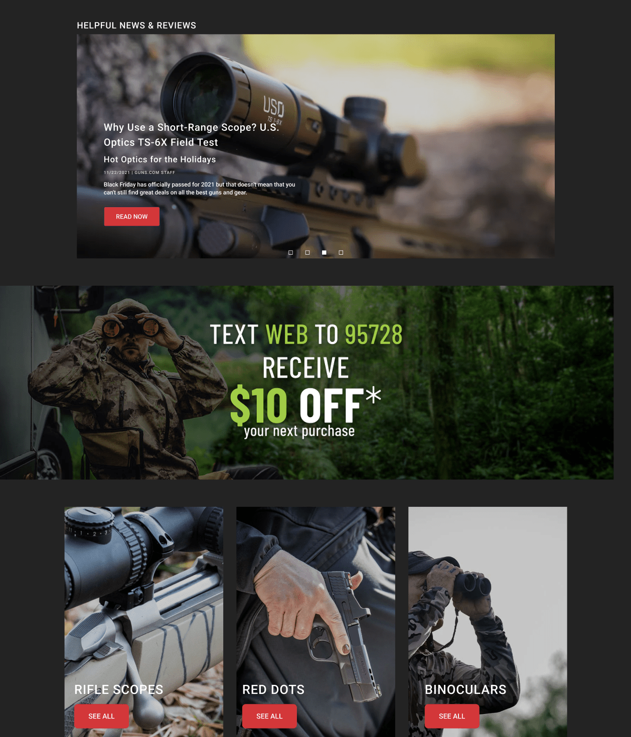
When you talk about your product, simple design and simple interfaces are better. Use clear language and avoid unnecessary elements or complicated designs that may lead to confusion.
Having sections like these that put certain products on display can push customers to make a purchase, increasing your website’s conversion rate.
Mega Menu
The new Megamenu we implemented here is a cutting-edge mega menu solution that empowers shoppers to quickly and easily navigate the website’s content.
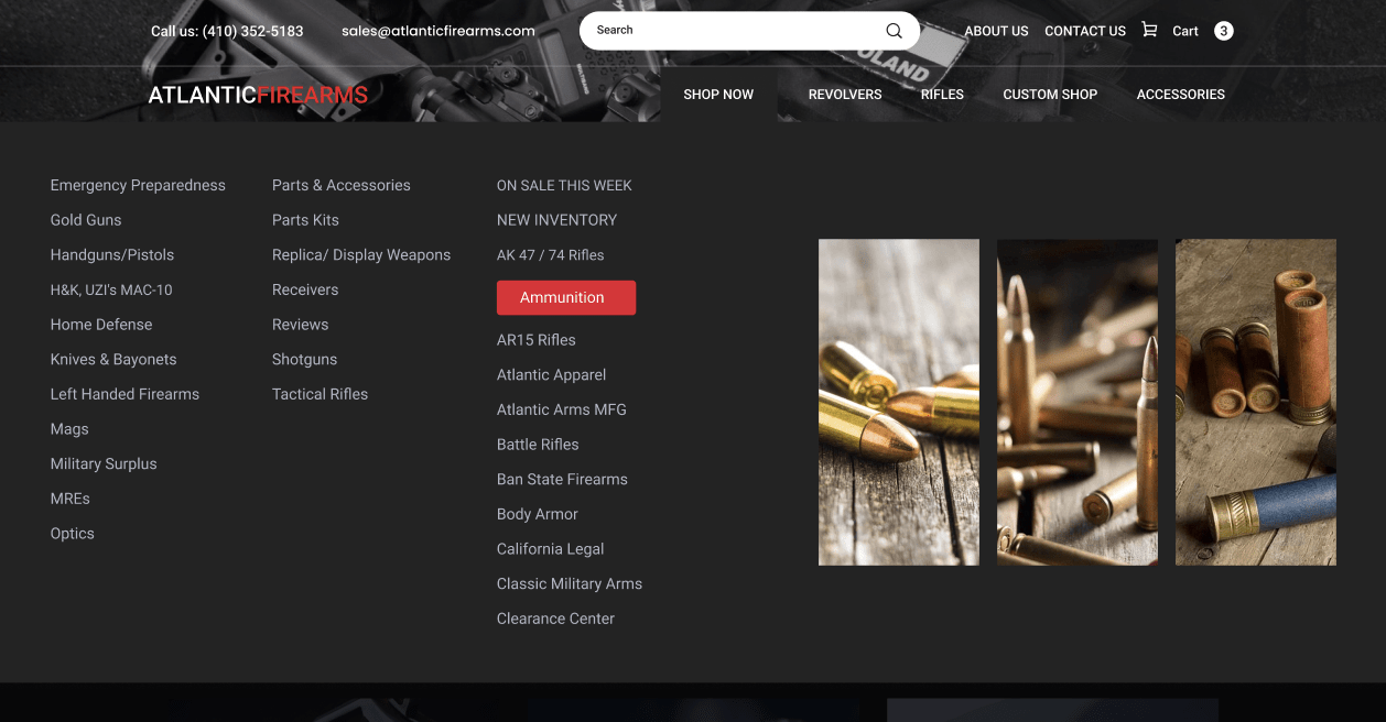
With its intuitive interface, Megamenu makes it easy to find the products or information you are looking for. In addition, Megamenu’s advanced features enable you to customize the look and feel of your menu, making it an essential tool for any online store.
Not only does it allow for easy navigation, but it also reduces clutter, promotes relevant products, and guides shoppers to exactly what they are looking for.
Mega Menus Beat Regular Dropdowns
If you have many pages and options on your website, you may want to use a mega menu. A traditional drop-down menu becomes difficult to read when the number of options gets too large.
Whether you are looking for a way to improve your website’s navigation or simply want to give your shoppers a better experience, Megamenu is the perfect solution.
Product Pages
We also took a close look at the individual product pages and made some changes to the layout and design.
The goal here was to ensure that all of the important information was out there, easy to find, and without being overwhelming.
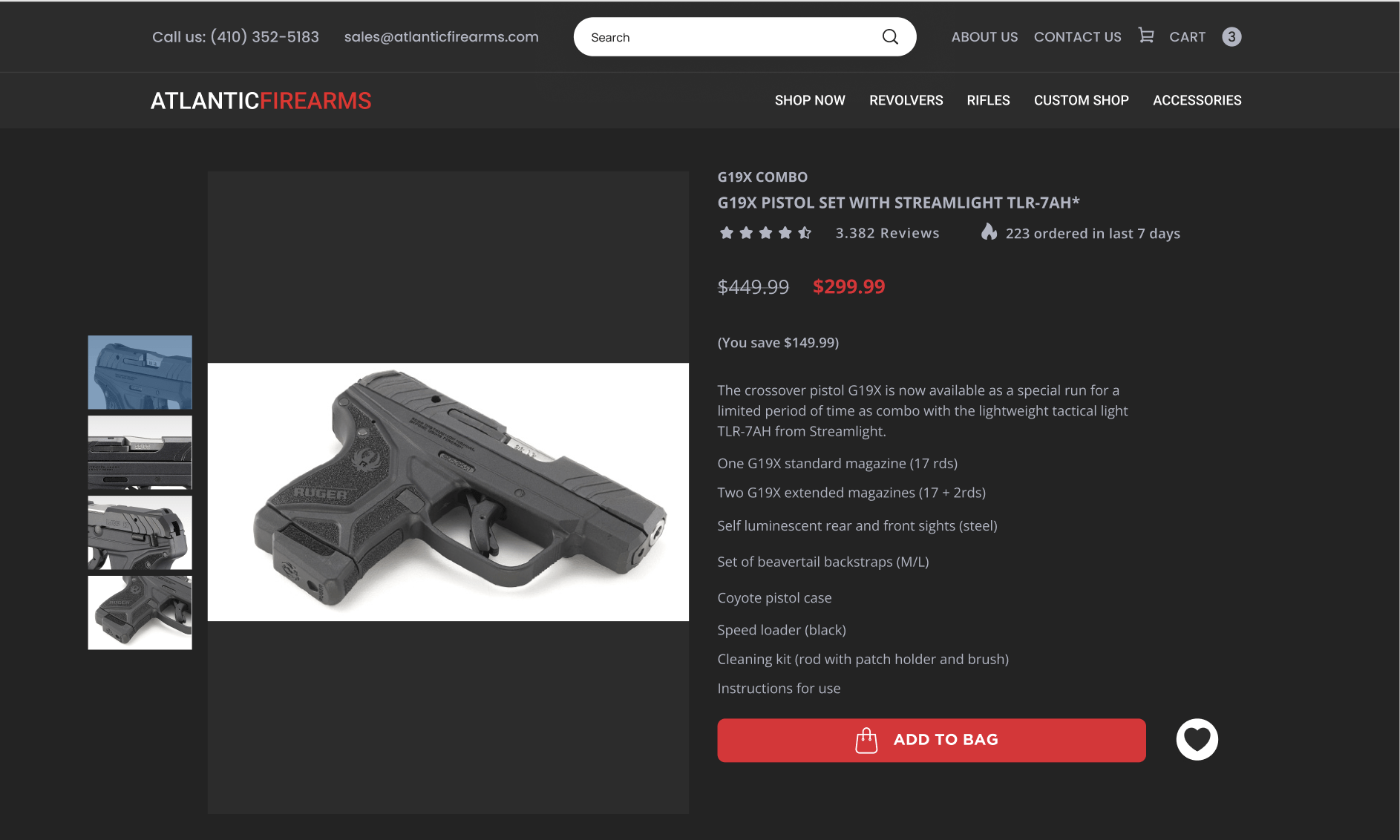
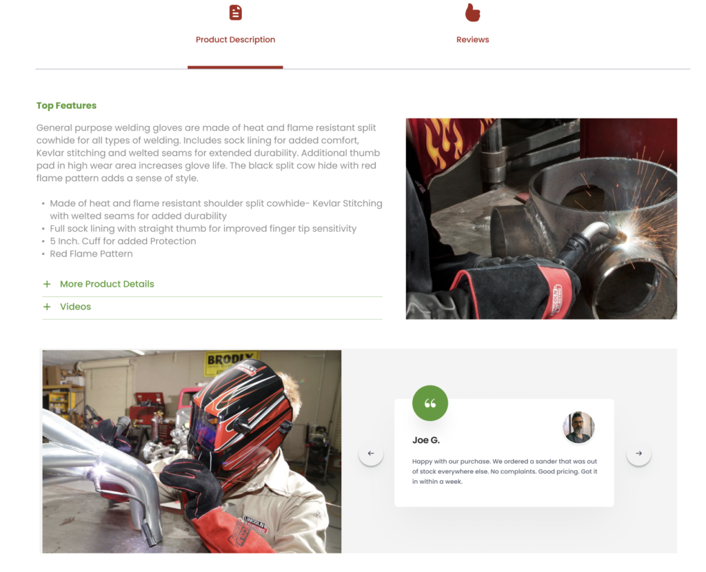
Reviews and proof of authenticity are essential when customers are looking to purchase items online. In an age where anyone can create a website and sell fake or low-quality products, it is important for you to provide potential buyers with reassurance that they are getting what they expect.
So we added a review and rating widget to the product pages. This will build the trust we need for them to turn into our customers.
This is why verified product ratings and proof of authenticity are such valuable features. By ensuring that your products meet high standards and are genuine, we help customers make confident purchasing decisions.
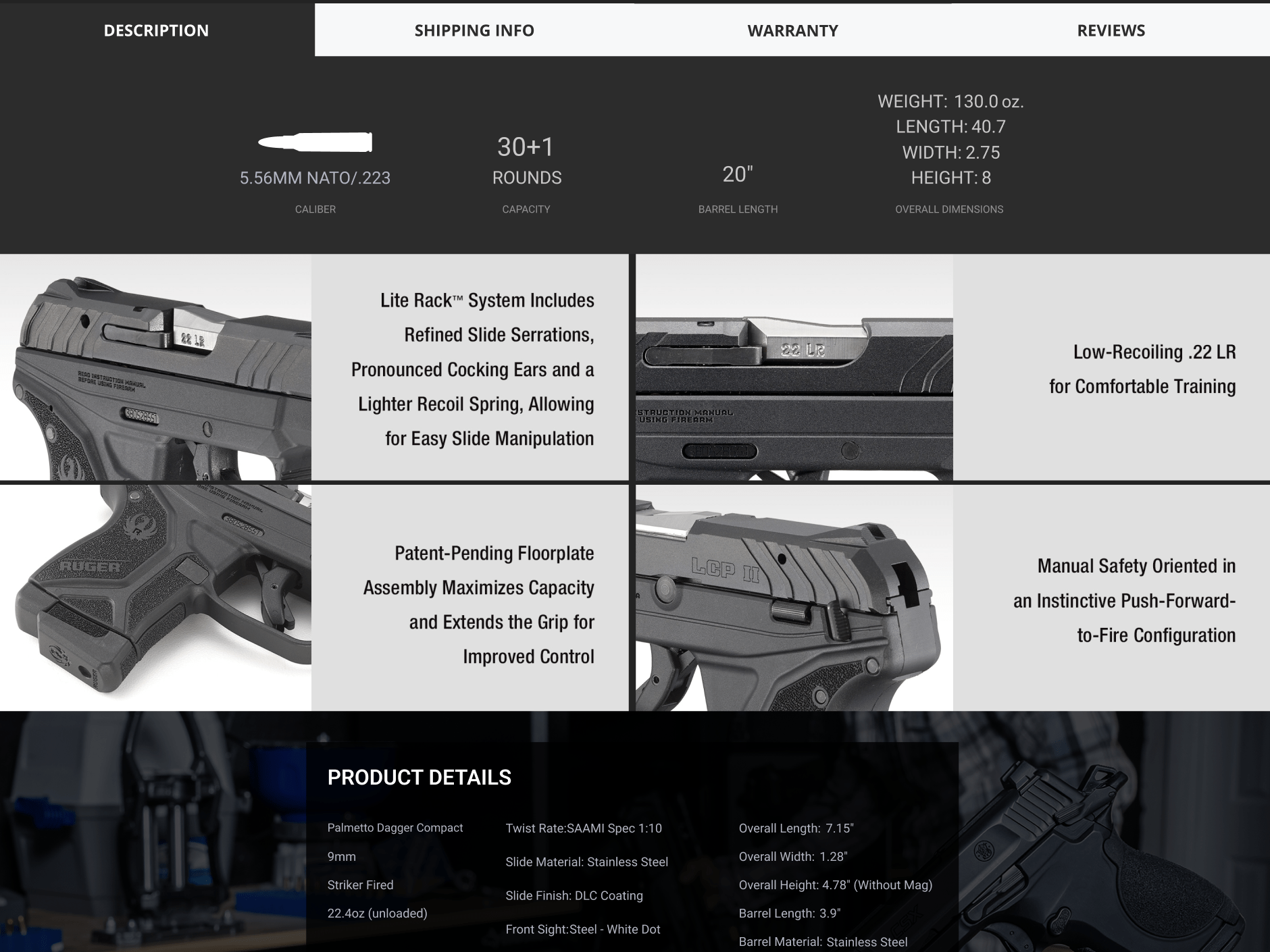
It is important to highlight the features and benefits of a product without overwhelming the customer. Bombarding them with too much information can be confusing and off-putting.
Instead, focus on a few key points that will be most relevant to the customer. For example, if you are selling a new car, you might want to focus on fuel efficiency, safety features, and warranty.
In atlanticfirearms.com’s case, we highlighted the key selling points for this pistol with high-quality images.
Sticky Add-to-Cart
Sticky Add-to-Cart is a bar that follows a shopper around to enhance the customer experience and increase conversions via custom functionality. The cart button follows the customer around as they scroll down the page looking for more information about the product.
This ensures that the customer can always find the add-to-cart button, no matter where they are on the page, and makes it easy for them to purchase the product.
Conclusion
We are very pleased with the results of the atlanticfirearms.com’s redesign. The new design is modern, sleek, and easy to navigate.
It also includes several important trust-building elements that will help increase conversion rates. We are confident that the new website will provide a better experience for the customers and help them grow their business.
If you are looking to redesign your website, we highly recommend that you consider these important factors. Contact us and let Optimum7 help you with your re-design and development project. A well-designed website can make a big difference in your business.


